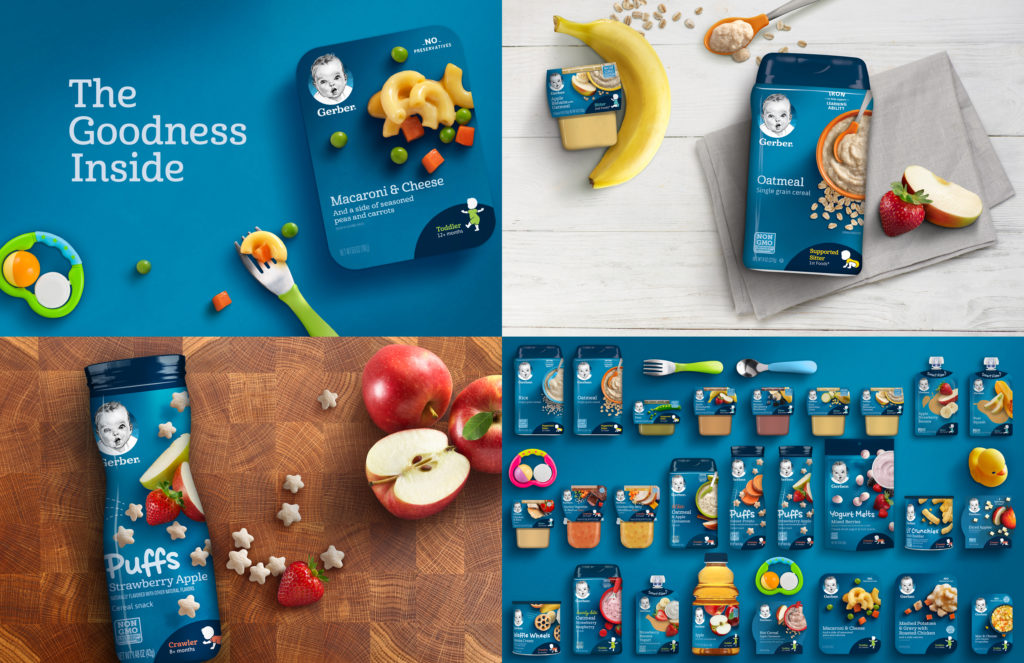
 D. Gerber Brand Expression and Packaging: For Gerber, the entrant updated the iconic brand identity and expression, then brought it to life across their extensive range of baby food, snacks, cereals and toddler meals. Our approach balanced the brand’s deep heritage with the need to connect with the time-crunched, health-conscious parents of today. Making the most of the beloved Gerber baby, awe enhanced the original sketch’s character, warmth and equity. We show empathy for mom’s hectic life, by simplifying on-pack communications, capturing the simple imperfect beauty of real food, and featuring the stage appropriate for her baby. In an unexpected shift, we filled the background with a rich, textural blue that makes the food stand out, feels premium and celebrates the brand on shelf. We also evolved the brand voice—a relatable “savvy big sister” persona that guides and informs while also reassuring and encouraging moms.
Home 19D. Gerber Brand Expression and Packaging

