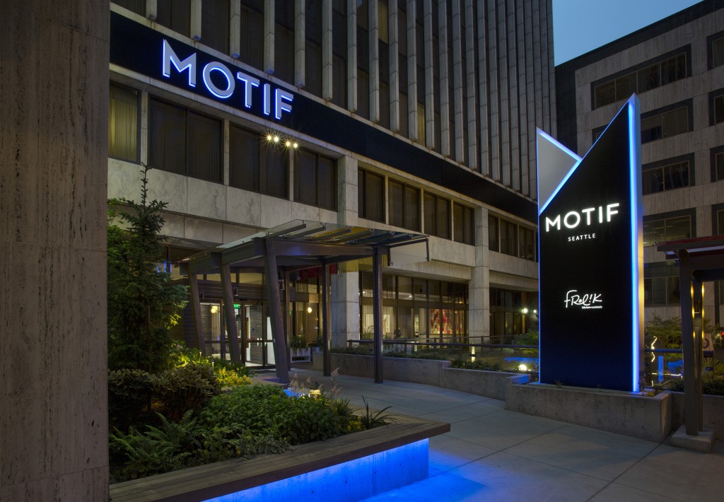
D. Motif Seattle:
The Project
– To create an exterior sign program that communicated an urban character for the newly branded, Motif.
– To change the signage, hindered by cluttered architecture, into a sleek visual presentation.
– To make the entrance memorable and welcoming. The signs’ exterior imagery and lighting reflected a corresponding interior quality. Since it is the first Motif Hotel, a new visual statement was critical.
The 20-story building presented a challenge to safely install 18-foot logos near the top of the structure. Speciality scaffolding was used to lower technicians down the side of the building, taking particular care for their safety and that of street-level passersby.
The Solution –
Teams consisting of sales, design, and installation analyzed traffic patterns and sight lines to pinpoint optimal sign placement. The entrant scrutinized details to include color and lighting to achieve results with impact. Then throughout the execution phase, they met the client’s goals for cost.


