Identity
Due to the large number of entries in this Category, two Big M, Merit Award and Merit Mention winners were selected. The winners are listed in alphabetical order below.
Winner: cka Creative
TITLE: Buried Cane Premium Wines: Buried Cane is more than just a wine term describing a critical growing technique. It’s a living, breathing philosophy in this Walla Walla winery. Care was taken to translate this to all packaging elements with the proper amount of rustic flourish and graphic detail.
CLIENT: Middleton Family Wines
CREDITS: Jim Carey
Mark Anderson
Dan Fraser
Steven Noble (Illustrator)
Winner: GA Creative
TITLE: Tacoma Art Museum Logo: Designing a logo for a museum is no small task, especially when it sets the stage for the launch of a $17 million fundraising campaign. Echoing the existing museum logo and using art and architecture as inspiration, the agency created a campaign for the museum that incorporates a modern yet playful grid to emphasize the work ART. The vibrant color palette represents the dynamic communities the museum serves.
CLIENT: Tacoma Art Museum
CREDITS: Designer: Joey Marin
Art Director: Sara Patillo
Account Manager: Julie Burke
Merit Award: Walsh Design
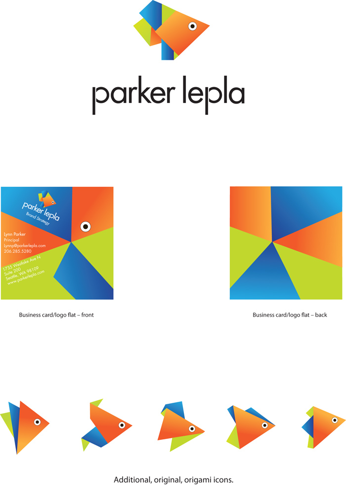
TITLE: Origami Koi Logo: When this design firm was approached by Parker LePla to update its logo to better reflect how it has changed as an organization, the answer was easy. Their emphasis now is all about helping clients create “brand-defining experiences.” And they wanted to make their logo an experience—with dimension. The agency has a pond in the entry to its office, stocked with 13 koi fish, many more than 12 years old, and that has become an important part of its brand identity. The design firm came up with the perfect idea: a foldable card that turns into an origami koi logo. The card is presented unfolded and then folded in front of the client or prospect—which becomes and experience in and of itself.
CLIENT: Parker LePla
CREDITS: Miriam Lisco
Lisa Henderson
Merit Award: cka Creative
TITLE: Auction of Washington Wines : The preeminent wine auction in Washington State demands savvy marketing and keen industry appeal. The wine world spectacular, which culminates in a four-day extravaganza of festivities, benefits Children’s Hospital and Enology at WSU. As a result, it also pedestals all Washington wines—the mighty and modest alike.
CLIENT: Auction of Washington Wines
CREDITS: Jim Carey
Mark Anderson
Dan Fraser
Ryan Grantier
Merit Mention: 206
TITLE: The Seattle Metropolitan Chamber of Commerce: In order to bring new relevance and a contemporary vibe to the Seattle Chamber, the agency updated its identity to reflect the multi-layered depth of the Chamber’s work throughout the bustling region and to help the organization connect with a new generation of new business leaders.
CLIENT: The Seattle Metropolitan Chamber of Commerce
CREDITS: Principal, Creative Director: Tad Harmon
Principal, Consumer Engagement: Mark Dyce
Senior Designer: Rachel Roebuck
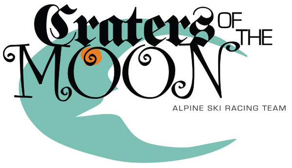
Merit Mention: Craters of the Moon
TITLE: Craters of the Moon: This is a logo for the Craters of the Moon startup agency.
CLIENT: Craters of the Moon
CREDITS: Creative Director: Kevin Nolan
Designer: Kevin Nolan
Account Executive: Alyssa Taylor
Poster
Winner: Blankslate Creative
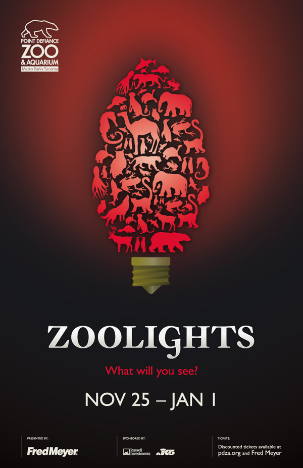
TITLE: Zoolights: These posters (11×17 and 22×28) were the foundation of a larger campaign promoting PSZA’s annual Zoolights holiday event in which the zoo is decorated with over 500,000 lights and opened to the public at night. The design was a huge departure from the past years and helped contribute to record-breaking attendance. Double-click on poster to view campaign
CLIENT: Point Defiance Zoo & Aquarium
CREDITS: Creative Director: Jim Craig
Designer: Susan Phillips
Copywriter: Joe Moore
Merit Award: Bullseye Creative
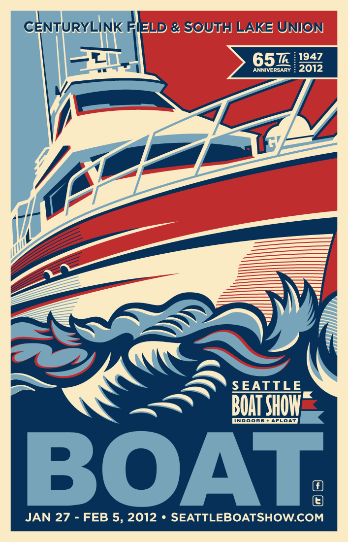
TITLE: Seattle Boat Show “Boat 2012” Poster: As part of our “Boat 2012” advertising campaign for the Seattle Boat Show, the agency designed and illustrated this beautiful poster promoting the event. The oversized screen-printed poster (a tongue-in-check tribute to the often-spoofed 2008 “Obama HOPE” poster by Shepard Fairey) featured a hand-drawn bow of a trawler boat majestically crashing through waves of water. The proud, patriotic image of the ship is underscored by the bold statement, “BOAT” – a play on Fairey’s famous “HOPE” title.
The successful poster design contributed toward an amazing event, and – for the first time ever – the show’s producers were forced to run a second printing of the posters. This was due to the high demand for additional copies for retailers, merchants, exhibitors and partners. Our client reported that this was easily the most popular poster in the show’s history.
CLIENT: Northwest Marine Trade Association (Seattle Boat Show)
CREDITS: James Klauser, Peter Klauser
Merit Mention: Cole & Weber United
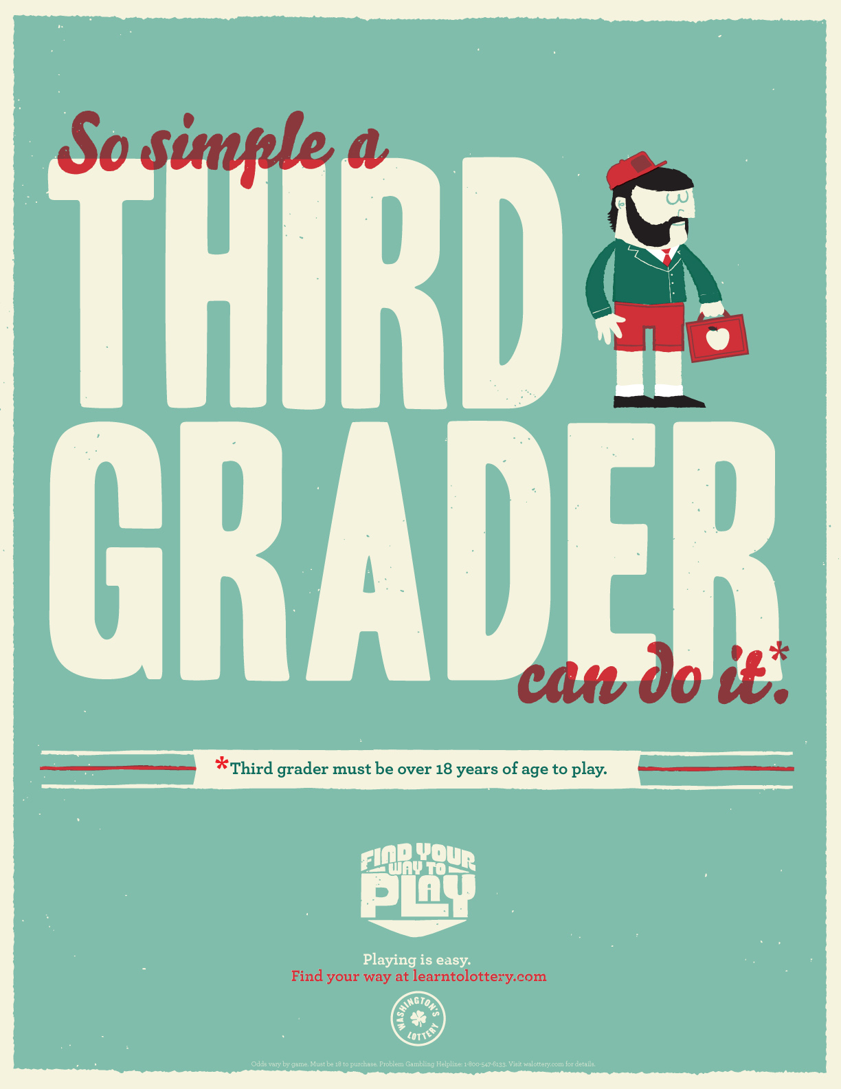
TITLE: Third Grader: This poster is from a series that ran throughout Washington State to dispel potential players’ fears of not knowing how to play – by demonstrating that there is no wrong way to pick numbers. Illustrated by a well-known artist, they were posted in bars, stores, outdoor sporting events, etc.
CLIENT: Washington’s Lottery
CREDITS: For Agency
Advertising Agency: Cole & Weber United
Executive Creative Director: John Maxham
Associate Creative Director/Art Director: Todd Derksen
Senior Copywriter: Jesse Dillow
Producer: Aylin Koker
Other than agency
Illustrator: Sasha Barr
Annual Report
Merit Award: GA Creative
TITLE: Northwest Kidney Centers’ Annual Report: Northwest Kidney Centers’ annual report is among an important educational, reporting, recruiting and development tool. Giving a first look at the organization’s brand refresh. The agency created and produced the 2011 annual report. The concept, “I live. I learn. I hope.” plays off the new tagline and speaks to the organization’s work in patient care, education and research. Stories told through content and visuals from patients, staff and generous donors who support the non-profit organization. Double-click on cover to view entire report.
CLIENT: Northwest Kidney Centers
CREDITS: Art Directors: Jeff Welsh and Sara Patillo
Designer: Joey Marin
Account Manager: Julie Burke
Illustration
Winner: Ken Shafer Design
 TITLE: Video Game Face: Editorial illustration for article exploring the pedagogy of gaming.
CLIENT: Columns magazine, University of Washington Alumni Association
CREDITS: Illustrator: Ken Shafer
Merit Award: Wunderman
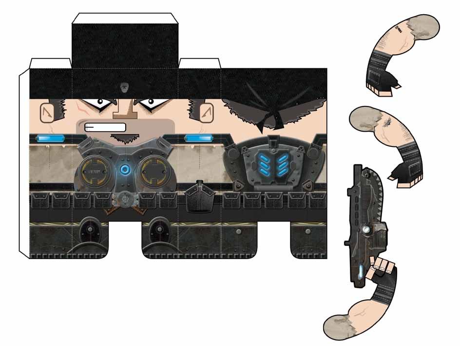 TITLE: Gears of War 3 – Break Down the Wall: With the release of the Xbox’s Gears of War 3 approaching, we created a website that allowed fans to unlock downloadable assets, including this papercraft. This papercraft design emphasizes the blocky, heavy design of characters and was created in-house to match the cartoon nature of the medium.
CLIENT: Microsoft (Xbox)
CREDITS: Account Director: James Bumpers
Account Supervisor: Jacci Johnson
Program Manager: Ericka Obenar
Strategist: Bob Zammit
Account Executive: Jennifer Bell
Director: Chris Elliot,
Manager, Project Management: Tammy Foss
Project Manager: Victoria Ostrovskaya
Associate Creative Director: Bo Geddes
Copywriter : Brook Willeford
Group Production Director : Meredith Letts
Associate Creative Director : Devon Harris
Business Director: Jason Grollman
Project Manager : Julie Pepper
Lead Developer : Dan Kieu
Senior Art Director: Brian Williams
Senior Copywriter Ben Reese
Consumer Data & Analytics Manager: Dawn Yadron
Xbox Analyst: Jeff Aylesworth
Merit Mention: Monlux Illustration
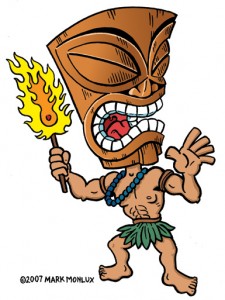 TITLE: Tiki Torch After posting this tiki on my blog it was licensed for a college a party. The university blog reposting drove the image high onto Google’s rankings. The increased exposure on Google resulted in a number of tiki-related projects, with queries coming in from as far away as South Africa.
CREDITS: Mark Monlux
Collateral
Due to the large number of entries in this Category, two Big M, Merit Certificate and Merit Mention winners were selected. The winners are listed in alphabetical order below.
Winner: Girvin
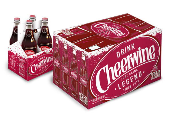
TITLE: Cheerwine: The agency’s previous cheerwine packaging design created an extremely positive reaction that invigorated the loyal brand community and beyond. When Cheerwine needed an update, it came to the agency again to develop a new, even livelier, refreshing line of product that would continue to speak to Cheerwine’s rich brand heritage. Double-click on the image to download additional images.
CLIENT: Cheerwine
CREDTS: Tim Girvin, Christina Sakura, William Johnson, Kevin Henderson, Michael Kenney
Winner: Hornall Anderson
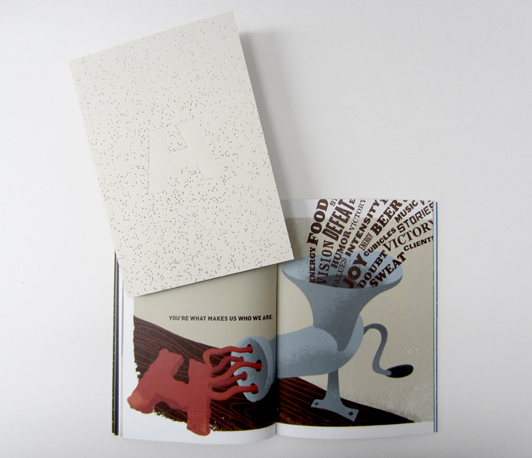 TITLE: Hornall Anderson Manifesto Brochure: The manifesto was created as an internal piece distributed to employees in concert with the agency’s announcement of it’s London office acquisition. The manifesto celebrates the beliefs, guiding principles and culture of the agency, while paying homage to its history, through bold typography, tactile pages, whimsical illustrations and humor. Double-click on the image to download entire brochure.
CLIENT: Hornall Anderson
CREDITS: Creative Director: Jack Anderson
Creative Director: Mark Popich
Designers: Jason Grube, Mark Popich
Account Manager: Maureen Estep
Illustrators: Andy Kribbs, Jason Grube, Ali Barrett, Jessixa Bagley, Bryan Mammaril, Kathleen Kennelly Ullman, Oliver Hutton, Ryan Meline, Jessica Lennard, David Phillips, Rob Zwiebel, Ashley Flanagan
Photographers: Ryan Meline, Rob Zwiebel
Copywriters: Ben Steele, Mark Popich
Merit Award: AllpakTrojan
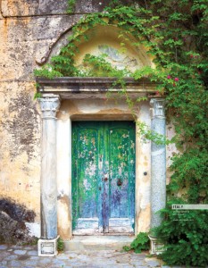 TITLE: Sell Sheets: We partnered with local photographer Jim Nilsen to help turn our sell sheets into works of art. They were printed on our 8 color KBA press on Flo paper stock. We also used special effects, such as reticulating and strike-through varnish, as well as PMS bump plates to make the colors even more vibrant. Double-click on the image to download a PDF of the document.
CLIENT: Allpak
CREDITS: Allpak Trojan Marketing Team
Photographer: Jim Nilsen
Merit Award: Blankslate Creative
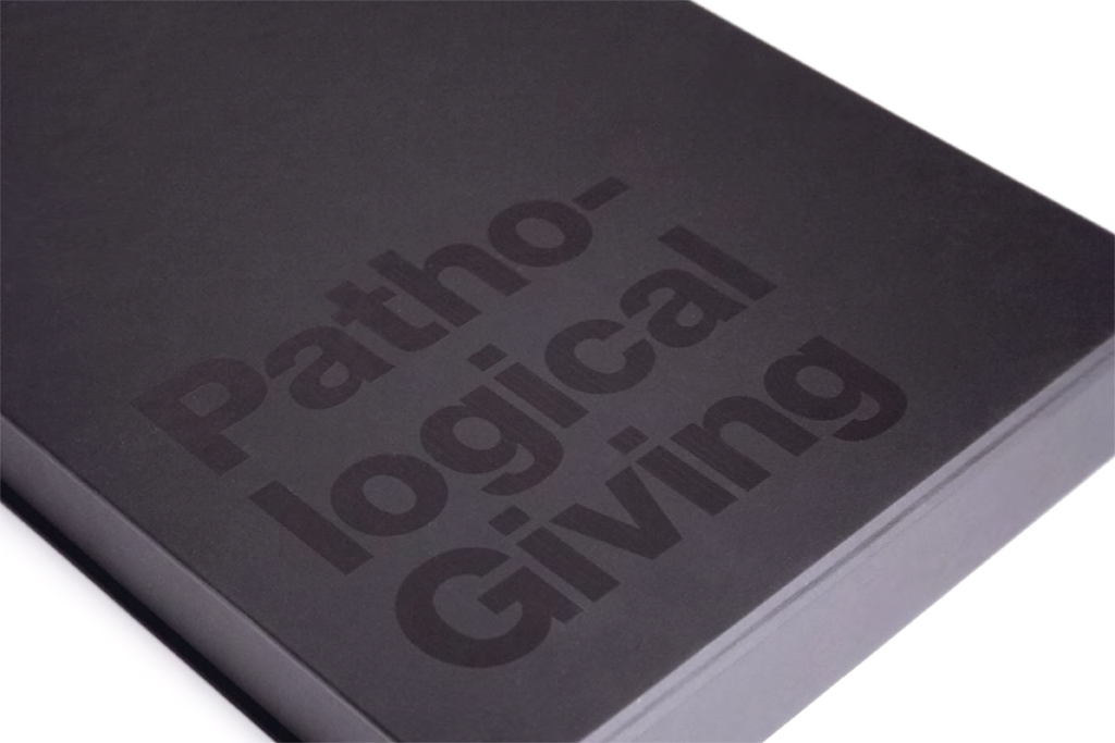 TITLE: Pathological Giving: This sales tool helped pathology lab CellNetix reach wish list accounts. By choosing CellNetix, every lab sample submitted earns a donation to charity. In the expressive messages and visual language of this campaign, the agency elevated a common cause shared with prospective clients—patient care that goes further than expected. Double-click on the image to download a PDF of the document.
CLIENT:CellNetix Pathology & Laboratories
CREDITS: Creative Director: Jim Craig
Designer: Sandy Roberts
Copywriter: Joe Moore
Merit Mention: 206
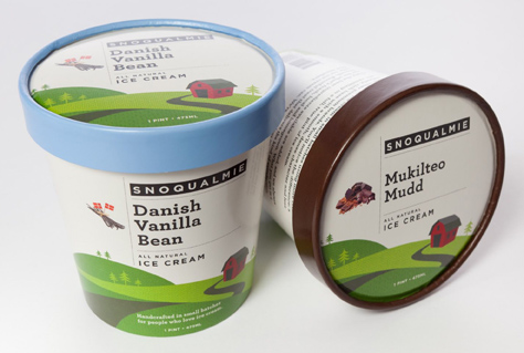 TITLE: Snoqualmie Ice Cream Packaging: The agency reinvented Snoqualmie Ice Cream’s brand from the ground up, redesigning bright and playful packaging that would stand out among other market leaders and take advantage of the authentic attributes of this local gem, including a sustainable farm where many of the ingredients are grown. Double-click on the image to download additional images.
CLIENT: Snoqualmie Ice Cream
CREDITS: Principal, Creative Director: Tad Harmon
Senior Art Director: Colleen Ando
Associate Creative/Interactive Director: Mike Grigg
Manager Public Relations: Alyssa Goldberg
VP Public Relations: Michael Graubard
Principal, Consumer Engagement: Mark Dyce
Merit Mention: Girvin
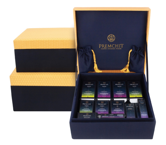 TOTAL: Premchit: The agency worked with Premchit to develop a visual strategy for an integrated health program that would be presented in some of the most remarkable resorts in the world. The agency created a brand using the Chakra color concept that would bring luxurious elegance and balance to the resort guest experience. Double-click on the image to download additional images.
CLIENT: Premchit
CREDTS: Tim Girvin, Danielle Amato, Deanna Carroll
Photography
Winner: Jason Hoover Photography
 TITLE: Library From Another Dimension: Dramatic full-color photo of the Seattle Public Library provided for an annual calendar.
CLIENT: PrintWest
CREDITS: Jason Hoover
Merit Award: Jason Hoover Photography
 TITLE: Seattle Center Sci-Fi: Dramatic full-color photo at sunset south of Queen Anne Hill across Seattle Center and downtown skyline to Mt. Rainier provided for an annual calendar.
CLIENT: PrintWest
CREDITS: Jason Hoover
Merit Mention: Studio 3
 TITLE: Taste like Chicken: The photographer was going for the obvious and way-overdone, 50s kitchen housewife. She was told to pick up the cat and BOOM, it was done. There’s nothing quite like uninhibited laughter. She had no idea I was going to shoot, and that’s the key and beauty of the image.
CREDITS:Photographer: Dana Jonas
Hair/Makeup/Wardrobe: Jonathon Levi Powell
Website
Winner: Bullseye Creative
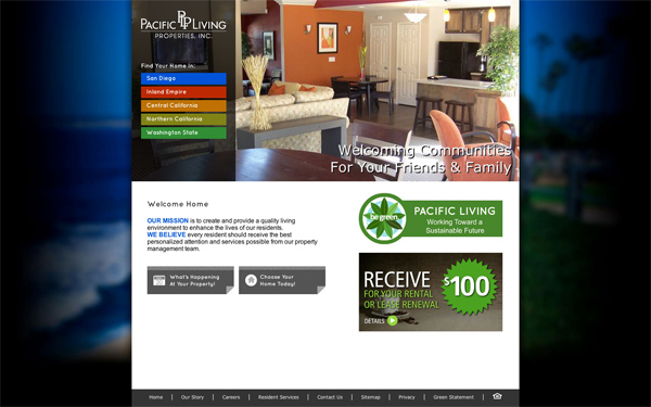 TITLE: PacificLiving.com: The agency designed and developed this dramatic, aesthetically pleasing website for a local multi-family ownership/management group. The client owns and manages several dozen properties in multiple regions along the west coast. The agency’s primary goal was to create a robust database-driven website that gave each property its own brand-consistent identity, while maintaining a connection to the larger parent business. Double-click on the homepage image to download select pages of the site or click here to be redirected to the site.
CLIENT: Pacific Living Properties
CREDITS: Robb Bartlett, Peter Noonan, Megan Ferland, Peter Klauser, James Klauser, Jamie Morley, Travis Kubicek
Merit Award: Creature
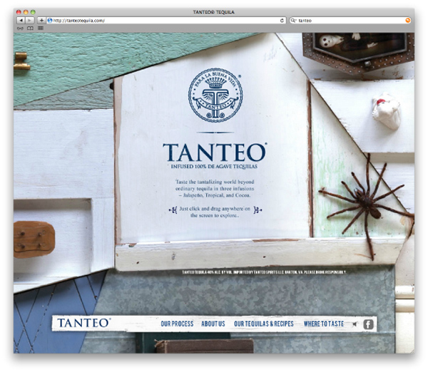 TITLE: TanteoTequilla.com: Tanteo is the new brand of infused tequila, a taste that goes a little beyond traditional tequilas. The website expresses the idea of “tasting beyond” by inviting the user to scroll in every direction from the main entry screen, discovering each different infusion along the way. Double-click on the homepage image to download select pages of the site or click here to be redirected to the site.
CLIENT: Tanteo Tequilla
CREDITS: Executive Creative Director(s): Jim Haven and Matt Peterson
Creative Director: Pam Fujimoto
Art Director: Chris Campbell
Designer(s): David Kaul and Drew Hamlet
Copywriter(s): Hemant Jain and Chris Riley
Artist(s): Whiting Tennis and Jack Hodge
Producer: Carol Hodge
Production Company: Alarming Industries
Client Services Director: Steve Hawley
Production: Bethany Papenbrock
Digital Producer(s): Michael Johnston and Dave McKeague
Merit Mention: Girvin
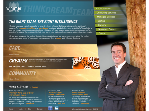 TITLE: WimmerSolutions.com: The agency worked with the clinent, a consulting and management provider, to develop a new strategic positioning: CARE, CREATES, COMMUNITY + THINK DREAM TEAM in an energetic business site that reflects the vibrant and positive atmosphere of the company. Using dynamic visuals and jQuery motion, the agency focused on the people to capture the spirit of the companies and the individuals who help drive the business. Double-click on the homepage image to download select pages of the site or click here to be redirected to the site.
CLIENT: Wimmer Solutions
CREDITS: Chie Masuyama Sharp, Danielle Amato, Chris Moorhead, Kevin Henderson
Mobile App
Winner: Exclaim
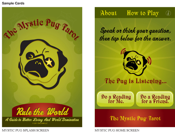
TITLE: Mystic Pug Tarot App: This question-and-answer app was designed as a follow-up to the Mystic Pug Tarot card deck the agency developed in 2003. Double-click on cards to download additional images.
CLIENT: EXCLAIM
CREDITS: Creative Director: John Schuler
Art Director: Michelle Stewart

