Web Video
Winner: Digital Kitchen
Stanley, the World’s First Interactive Player Piano: What if a player piano could take requests? In the hacker/maker spirit of the agency, our team re-imagined a forgotten technology as a simple interactive experience that connects people and music and in new way. Meet Stanley. The world’s first instrument to have a conversation with its audience and field its own song requests.
_____________________________
Merit Award: Hey,
CBT Nuggets Hero Video: Subscribers dig the easy to follow training style provided by CBT Nuggets, an online training resource for IT Pros. CBT Nuggets combine a whiteboard with commentary from the IT world’s most knowledgeable experts for their lessons. Jumping off of the whiteboard, we created an animated world out of dry erase marker drawings and clipped images. The video gets inside the head of an IT pro, demonstrating an understanding of his world and the challenges he faces.
_____________________________
Merit Mention: Spin Creative
Treehouse “Doors of Opportunity” Brand Film: Spin Creative produced this brand film about Treehouse, a Seattle-based non-profit improving the lives of kids living in foster care. The film launched at the Treehouse annual fundraising luncheon, “Champions for Foster Kids,” and was crafted in TV commercial form, to have multiple uses and delivery channels post event.
_____________________________________________________
Website: Design
Winner: Copacino+Fujikado
Click image above to view website.
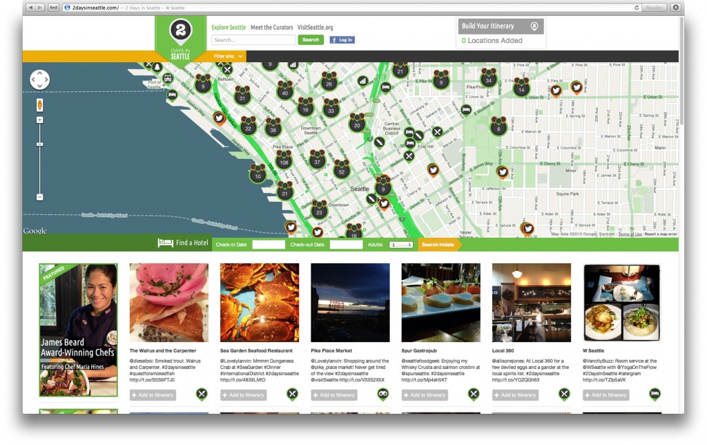
2 Days In Seattle, 2DaysInSeattle.com: Sure, we could tell you what a great place Seattle is to visit. Instead, we decided to let actual visitors do it for us through their Tweets and photos.
We invited social media mavens who are influential in the topics of food, wine, arts and culture and gave them a free trip to Seattle, no strings attached. They weren’t required to Tweet, but we only requested that if they did, they use the hashtag #2DaysInSeattle.
They came and set Twitter ablaze, unleashing a torrent of Seattle-centric Tweets and pics. Using geolocation technology and the #2DaysInSeattle tag, we were able to almost instantly upload their Tweets to our interactive map on 2DaysInSeattle.com, attaching their content to restaurants, attractions, music venues and more. The 2 Days In Seattle campaign became so popular, we even had former star of The Bachelor Ben Flajnik take part in it.
The final result? An authentic interactive experience that’s a living travel journal of top Seattle destinations and hidden hotspots that grows each time one of our visitors Tweets out “#2DaysInSeattle”.
_____________________________
Merit Award: Eben Design
Click image above to view website.
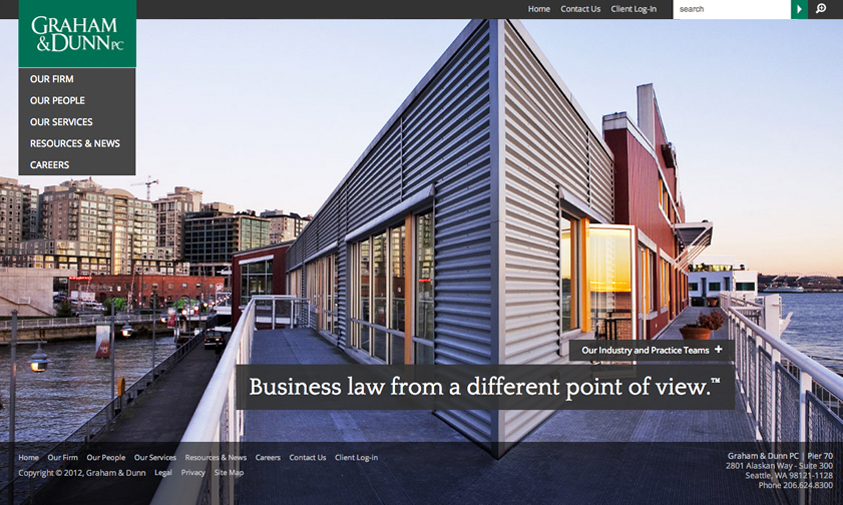
Graham & Dunn, www.grahamdunn.com: Graham & Dunn is uniquely positioned within the legal industry so we created a large image focused design to help communicate the new tagline “Business law from a different point of view.” The site aimed for a “less is more” approach by being open, uncluttered, professional and approachable.
_____________________________
Merit Mention: Bullseye Creative
Click image above to view website.
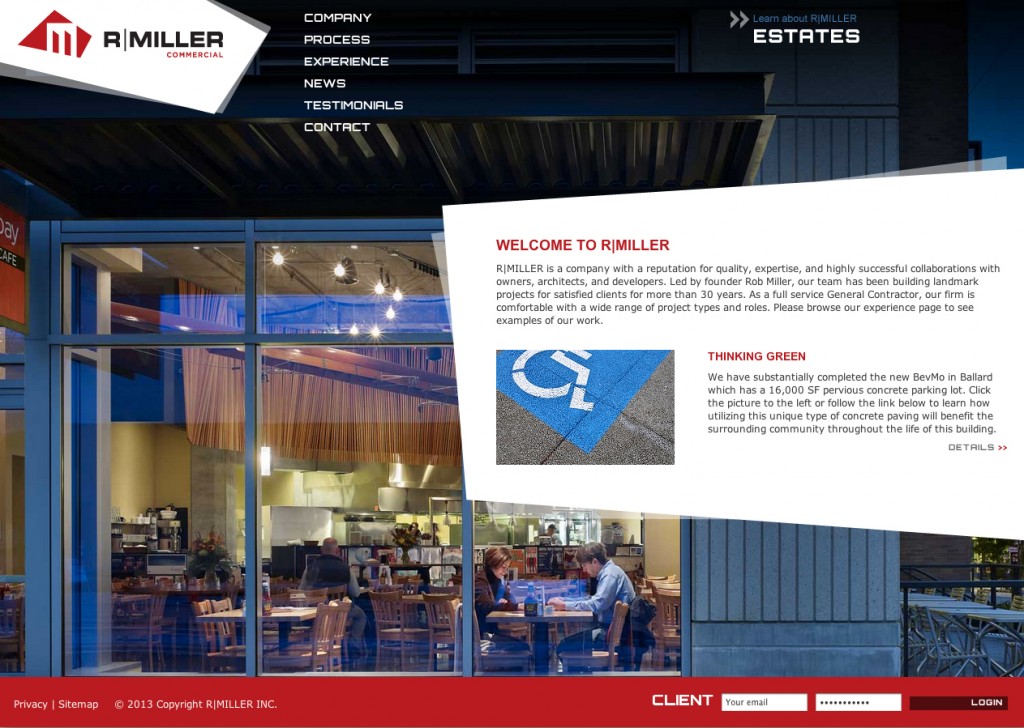
R Miller Inc. Website Design, www.rmillerinc.com: R Miller is easy on the eyes … and we’re not just talking about their website (wait…This just got awkward).
We designed the high-impact, dynamic website for this local construction company to showcase the visual beauty of their work. The site is fully supported by a robust custom content management tool, allowing the client to manage updates to key content and keep their portfolio current. A key challenge was presenting the company’s two sides (commercial and residential/estate) in a brand-consistent manner, so we featured a call-out in the top right-hand corner allowing users to toggle back-and-forth between the two sites. The result is a winning (*hint* *hint*) website with stunning visual design and a friendly user experience.
_____________________________________________________
Website: Consumer
Winner: Bullseye Creative
Click image above to view website.
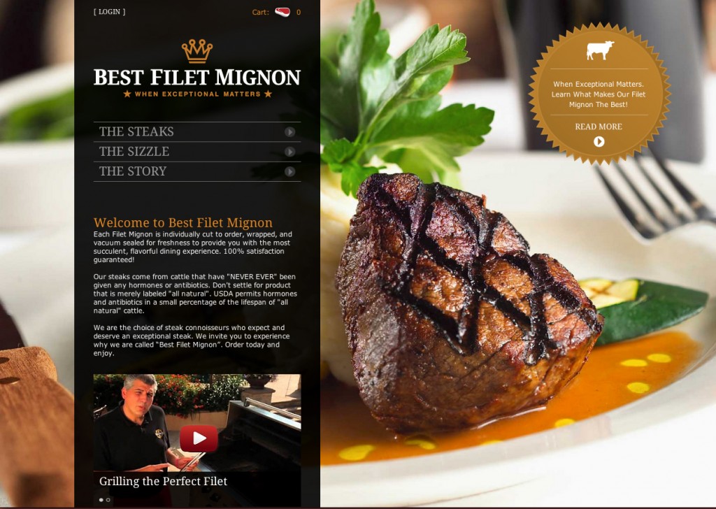
Best Filet Mignon e-Commerce Website, bestfiletmignon.com: (WARNING: Judging This Website Will Make You Very Hungry!) We designed this simple and elegant e-commerce website to deliver a virtual experience of tasting the company’s top quality steak products (that is, until Taste-o-Vision™ is perfected as a viable web technology). The user experience is sleek and smooth, like the atmosphere of a high-class steakhouse, and the online ordering process is simple and intuitive. Take a tour of our steak site, and prepare to experience that mouth-watering sensation. Don’t say we didn’t warn you!
_____________________________
Merit Award: South King Media
Click image above to view website.
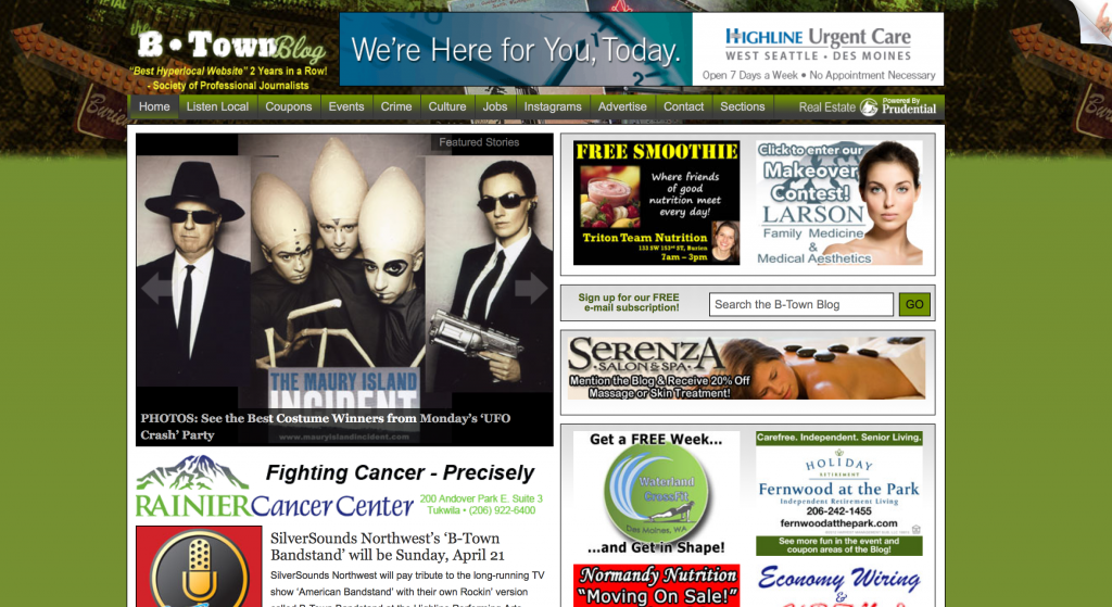
The B-Town (Burien) Blog, www.b-townblog.com: Local News and Events Blog for Burien, WA
_____________________________
Merit Mention: Marketing Puget Sound
Click image above to view website.
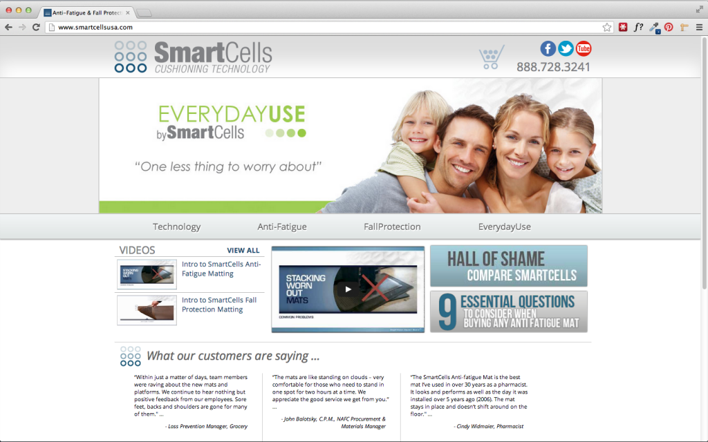
SmartCells USA Website, www.smartcellsusa.com: SmartCells USA needed a cleaner and more organized user interface with an functioning shopping cart to better service their customers. Their new website successfully showcases their amazing products while providing all of the necessary information surrounding current anti-fatigue and fall protection surface technology.
_____________________________________________________
Website: B2B
Winner: Hydrogen
Click image above to view website.
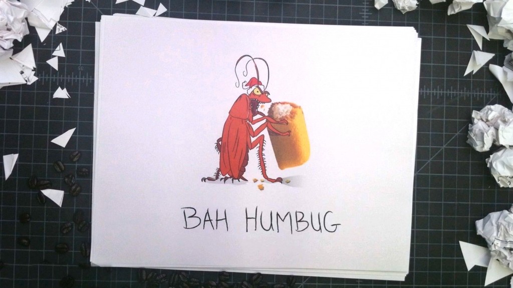
12 Days of Misery, 1hydrogen.com/12days: Every day for 12 days, we added a new day’s worth of ideas in an effort to solve the dreaded “agency holiday greeting” assignment. The winning idea was revealed on the last day.
_____________________________
Merit Award: Bullseye Creative
Click image above to view website.
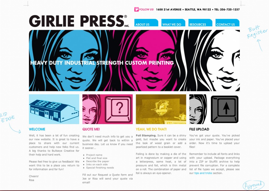
Girlie Press Website, www.girliepress.com: Girl Power!! Girlie Press is a female-owned Capitol Hill commercial printer known for kicking ass and taking names. Our website focuses on the playful approach the company takes with their image. The design features CMYK image overlays, mark-up styling, and printing lingo. Where else can we get away with using the term “Butt Register”? (wait … don’t answer that). Take a spin through the website, and enjoy the view. Ladies first.
_____________________________
Merit Mention: Hey,
Click image above to view website.
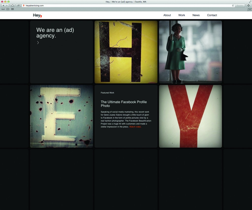
Hey, Website, heyadvertising.com: Our award-winning website showcases the Hey, agency in a clean and inventive manner while the responsive design provides an aesthetically pleasing view on any desktop, mobile phone, or tablet.
_____________________________________________________
App
Winner: Copacino+Fujikado
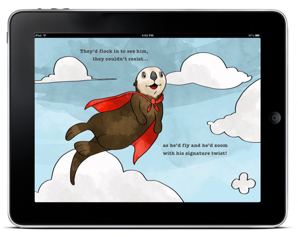
Edwin the Otter e-Book: The Seattle Aquarium is a magical place, with incredible creatures, amazing octopi, and adorable otters. And the Seattle Aquarium wanted us to tell that story on the sides of buses and buildings with an out-of-home campaign. Instead, we decided to tell the story in an actual children’s story to create a truly engaging interactive experience. We wrote, illustrated and developed a free children’s iBook called “Edwin The Super Duper Otter,” a story about an otter in the Seattle Aquarium who’s worried he’s not quite as special as the other animals. But along with a feel-good story about gaining self-esteem, we also gave readers a glimpse into the Aquarium itself with videos featuring octopus, seals, puffins and more. We added quizzes and slideshows, and included educational content about endangered water species. We released it as a free iBook to near instant success. For the last nine months, it’s been on the New & Noteworthy list and cracked the Top 10 in free Children’s iBooks. And it’s hit 90,000 downloads and continues to average 3,000 downloads per week. More importantly, we brought the Seattle Aquarium into people’s living rooms, where parents and their kids sit down and spend quality time together…and with the Seattle Aquarium.
_____________________________
Merit Award: Cole & Weber United
 Click image above to view video.
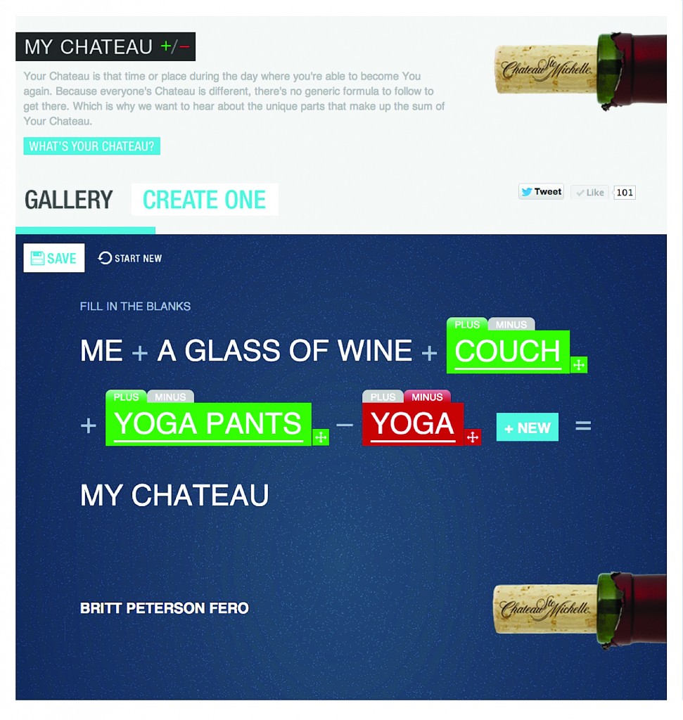
“My Chateau” Facebook App: What’s a Chateau? It’s when and where individuals can become reenergized and feel like themselves again. Because everyone’s Chateau is different, we created a My Chateau Facebook app that encourages our consumers to share their unique Chateaus. The submissions created an onlinequilt and some were inspirations for print ads. URL: https://www.facebook.com/stemichelle/app_457205170962458.
_____________________________
Merit Mention: Blend Creates
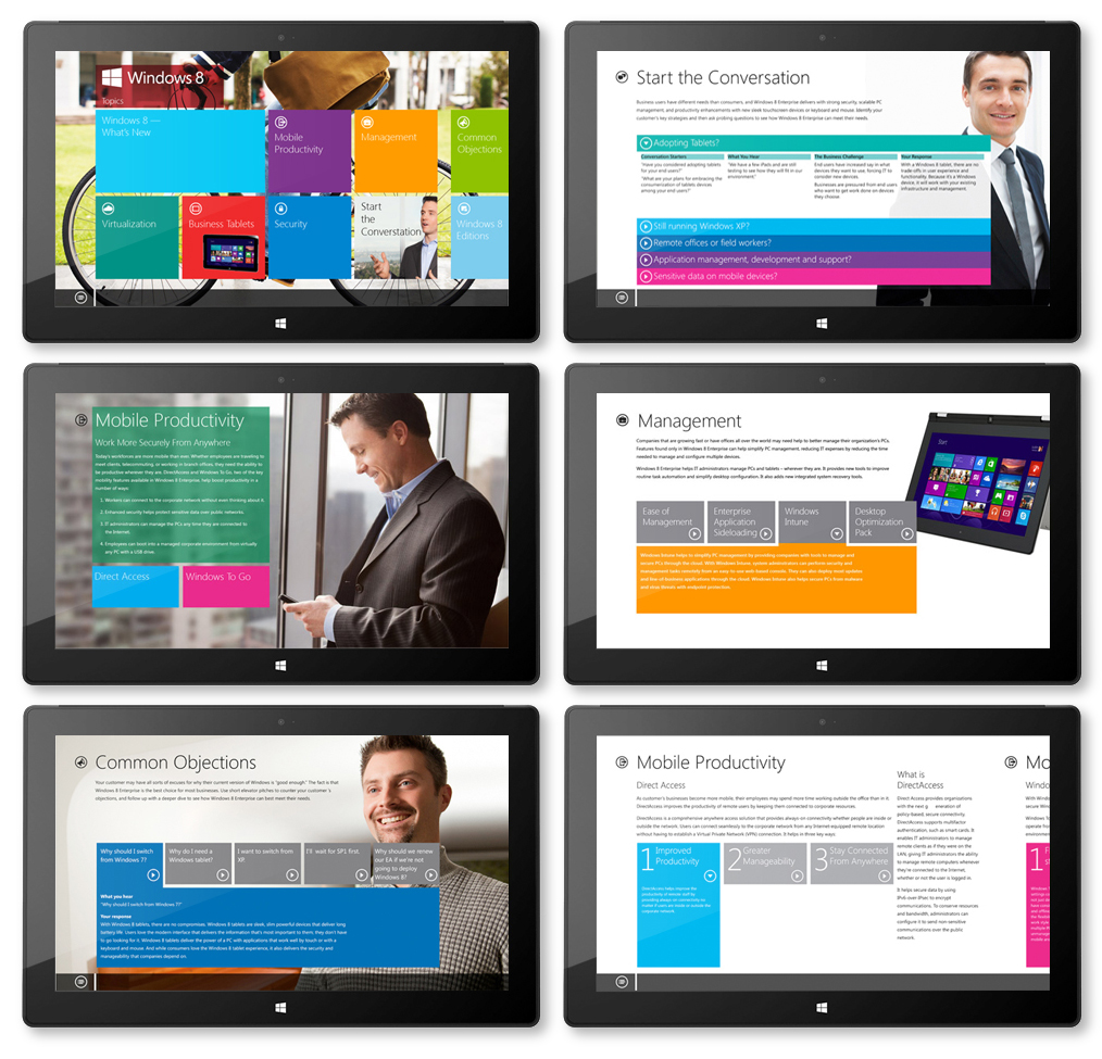
Microsoft Windows 8 Sales Training App: We developed the strategy, information architecture and visual design for a Windows 8 App. The app needed to be designed to run on the new touch screen devices as well as navigated with a mouse or track pad. The result gives it a unique look while maintaining the Microsoft brand.

