Brand Logo
Big M Winner: CKA Creative
TITLE: Fin De Semaine Winery: French for ‘End of the week’. This wine maker travels from winery to winery collecting the finest excess juice and collaborating with the best winemakers around to deliver unique small productions. It prompted the phrase appearing on every bottle: “Have wine will travel.”
CLIENT: Fin De Semaine Winery
CREDITS: AD Jim Carey
_______________________________________
Silver M Winner: Creature
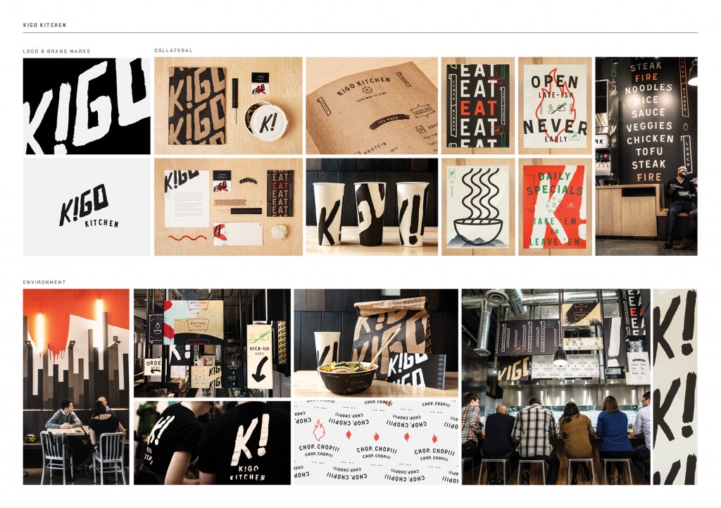
TITLE: Kigo Kitchen: Food is a way to experience adventure. Taste buds can take you places you have never been before—they can take you off the beaten path and make us feel changed, fueled and fired up. Kigo Kitchen is inspired by such adventure found in the back alleys of the pan-pacific where some of the world’s best street food is found, with a healthy dose of frenetic energy on the side. The brand is loud, bold and layered, referencing the fast and repetitious nature of being an alley chef. The bold, brushed type honors the hand-crafted quick-fire bowl and straight- forward messaging reflects communication on the kitchen line. By combining the exotic soul of Pan-Asian street food, with simple touches of American style, we created a curious, dynamic, and flavorful experience.
CLIENT: Kigo Kitchen
CREDITS: Chief Creative Officer/Managing Partner Jim Haven, CDs Clara Mulligan/Steve Cullen, Designer Clara Mulligan/Steve Cullen/ Jordan Rundle
_______________________________________
Bronze M Winner: CKA Creative
TITLE: Savisse Winery Logo: Live. Laugh. Love. Savisse brings together two life-long family friends combining their last names to forge their new venture based on a bond of friendship. This inspired the playful graphic of the union of two S’s.
CLIENT: Savisse Winery
CREDIT: AD Jim Carey, CD Mark Anderson
______________________________________
Corporate Logo
Big M Winner: Ken Shafer Design
TITLE: Dog Sitter: My client is a dog sitter. She printed beautiful letterpress business cards to hand out as a way of soliciting her service whenever and wherever she meets a fellow dog-person (and dog). She’s a busy dog sitter.
CLIENT: Private Individual
CREDITS: Design: Ken Shafer
_______________________________________
Silver M Winner: Creature
TITLE: Kigo Kitchen: Food is a way to experience adventure. Taste buds can take you places you have never been before—they can take you off the beaten path and make us feel changed, fueled and fired up. Kigo Kitchen is inspired by such adventure found in the back alleys of the pan-pacific where some of the world’s best street food is found, with a healthy dose of frenetic energy on the side. The brand is loud, bold and layered, referencing the fast and repetitious nature of being an alley chef. The bold, brushed type honors the hand-crafted quick-fire bowl and straight- forward messaging reflects communication on the kitchen line. By combining the exotic soul of Pan-Asian street food, with simple touches of American style, we created a curious, dynamic, and flavorful experience.
CLIENT: Kigo Kitchen
CREDITS: Chief Creative Officer/Managing Partner Jim Haven, CDs Clara Mulligan/Steve Cullen, Designer Clara Mulligan/Steve Cullen/ Jordan Rundle
_______________________________________
Bronze M Winner: CKA Creative
TITLE: Coe Olympics: Every June, a grand tradition takes place at this local elementary school to mark the triumphant end of the school year — the Coe Olympics! Part competition, part joy, it’s an official rite of passage deserving of an official logo.
CLIENT: Savisse Winery
CREDIT: CD Mark Anderson
______________________________________
Poster/Flyer/Calendar
Big M Winner: Blankslate Creative
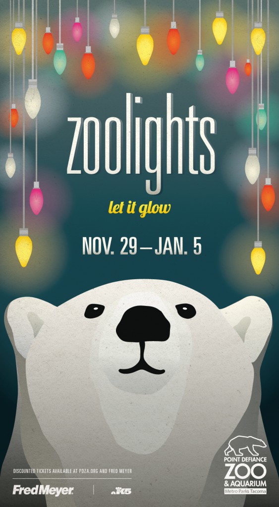
TITLE: Point Defiance Zoo & Aquarium—Zoolights 2013: Sometimes you just have to relax and bask in the glow. In this year’s campaign, the Zoo’s charming polar bear stands in for the viewer, soaking in the seasonal vibe as colorful lights shine overhead. The headline plays off a familiar winter refrain, adding an inviting, simple, and memorable call to action. Without actually saying it, all the elements combine to remind us that Zoolights is an absolute holiday classic.
CLIENT: Point Defiance Zoo & Aquarium
CREDITS: CD Jim Craig, Strategy Melinda Torres, Designer Susan Phillips, Writer Joe Moore, AE Kiki Temkin
_______________________________________
Silver M Winner: WONGDODY
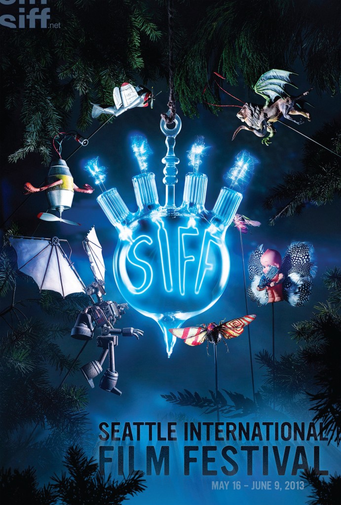
TITLE: SIFF—Like Moths to a Film: To make the breadth of films more accessible, the festival is broken down into different genres. So we represented each genre with a different figurative moth. All of the moths were created by local artists. And the centerpiece of the poster was a one-of-a-kind bulb made by Dylan Kehde Roelofs.
CLIENT: Seattle International Film Festival
CREDITS: ECD Tracy Wong, CD Monkey Watson, AD Garth Knutson, AD Adam Deer, Writer Peter Trueblood, AE Anea Klix, Print Producer Jessica Obrist and Sarah O’Donnell, Art Buyer Jessica Obrist, Project Mgr. Barbara Wilson, Retouch Artist Charlie Rakatansky, Electronic Production Gail Savage, Photographer David Emmite, Moth Makers Molly Anderson, Geakh Burchill, David Emmite
_______________________________________
Bronze M Winner: Pacifc Science Center
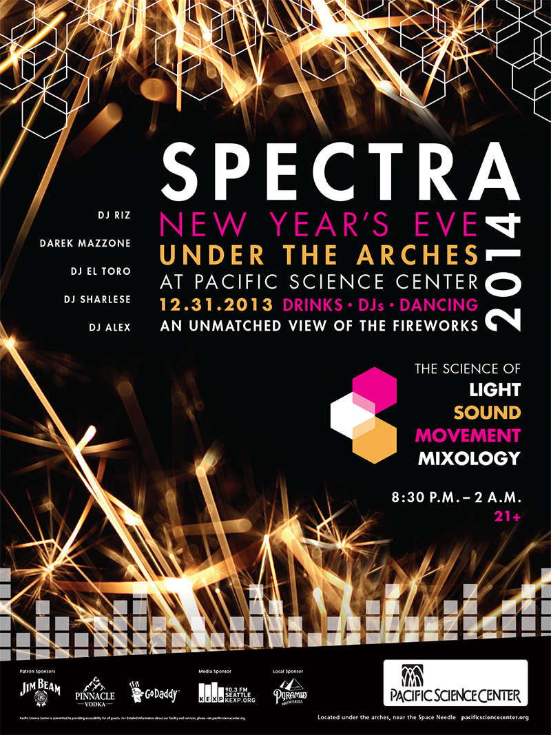
TITLE: Spectra 2014: Design for Pacific Science Center’s first annual New Year’s Eve Party. A night fueled by the science of light, sound, movement and mixology. The design was inspired by the highlight of the night, our close and exclusive view of the Space Needle’s incredible fireworks show. Hexagons were a prevalent image throughout the design representing magnified light which transformed nicely into a venn diagram of the theme as well as a chandelier’esque visual at the top. We celebrated our musical partnership with KEXP with a stylized equalizer. It was a night of glamour, elegance, science and fun.
CLIENT: Pacific Science Center
CREDITS: Designer: Lerin Mizar
______________________________________
Label Design
Big M Winner: CKA Creative
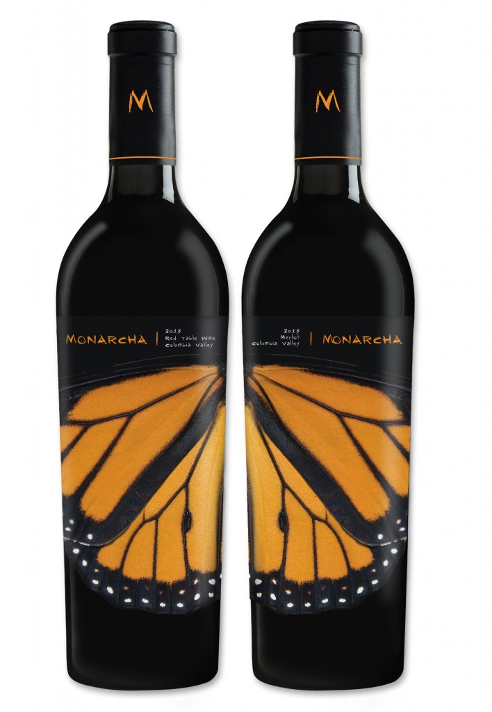
TITLE: Vino La Monarcha: The beautiful migration the Monarch butterfly takes every year from Michoacan to the North Americas is one of the world’s most fascinating events. The Palencia family legacy lives on a similar migration with the dreams of something better. To echo this deep belief, we took great care to craft a series of colorful wings to help their dream take flight with each bottle.
CLIENT: Palencia Wine Company
CREDITS: CD Jim Carey
_______________________________________
Silver M Winner: Sibyl Design
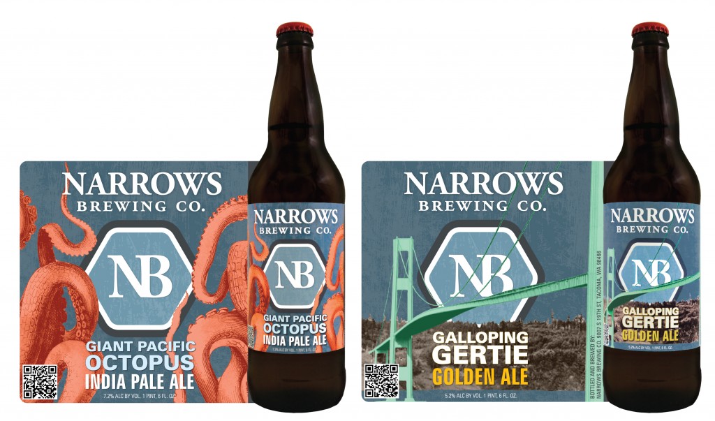
TITLE: Narrows Brewing Labels: These labels speak to the history of the Tacoma Narrows region, where Narrows Brewing made its home. Galloping Gertie Golden Ale is dedicated to the original Tacoma Narrows suspension bridge. It buckled and swayed for not even a year before it collapsed in high-winds. Giant Pacific Octopus IPA not only is a tribute to the great giant lurking below the waters, but also to the sport of Octopus Wrestling that was held in the Puget Sound.
CLIENT: Narrows Brewing
CREDITS: CD/AD Sibyl Perkins, Designer Tori King
_______________________________________
Bronze M Winner: CKA Creative
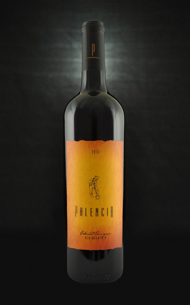
TITLE: Palencia Cabernet Sauvignon: The love and respect for the land culminates with the turning of the soil. Toiling and tilling to unlock the life force of the terroir. A simple line drawing of the act, set against a texture of scorching ochre and umber, capture the passion and love of the land.
CLIENT: Palencia Wine Company
CREDIT: AD Jim Carey
______________________________________
Packaging
Big M Winner: Walsh Design
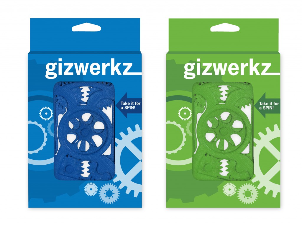
TITLE: 3D Printed iPhone Covers with Moveable Gears: We designed this box as a package to display a unique product, an iPhone cover that has moveable gears. We recommended this paperboard packaging that would be open enough to allow a potential customer to play with the gears without harming the packaging. The graphics on the package are a pms color and white transparent layers so that our customer can run multiple boxes with 1 pms color change.
CLIENT: Rapid Prototype Manufacturing
CREDITS: Designer Miriam Lisco, Product Name Kevin Burrus, Burrus Communications
_______________________________________
Silver M Winner: Hornall Anderson
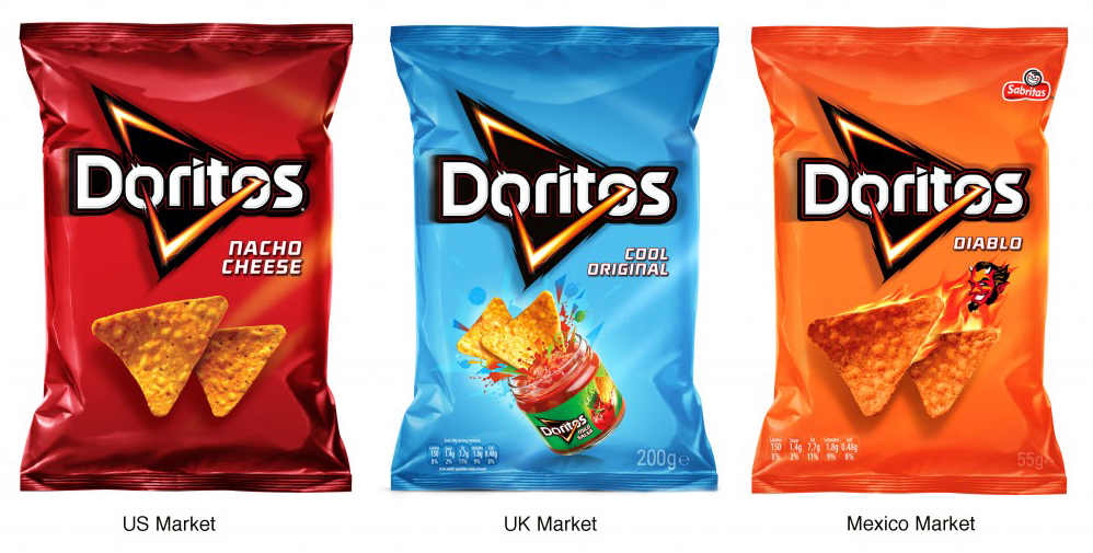
TITLE: Doritos Global Packaging Rebrand: DORITOS partnered with us to update its identity and packaging to create global harmonization and unleash the iconic brand’s power. Our team visited many cities across the world to see how DORITOS was shopped and discover how to best achieve emotional connections with its core demographic: teens and young adults.
To resonate with different cultures, the design elements needed to be flexible enough to address any culture’s specific requirements. Colors, chip photography, logo and the graphic elements proportions were all designed to create a harmonious and globally deployable visual translation of the brand and the brand purpose: Ignite You.
CLIENT: Pepsi-Co
CREDITS: CD Alastair Whiteley, Design Dirs. Matt Gandy & Andy Briscoe; Designers Howard Barrett, Claire Wright, Aidan Barrett; Production Judy Dixon, Alison Mumpower, Julie Valdez; Acct. Svcs. Lucy Fox
_______________________________________
Bronze M Winner: Blankslate Creative
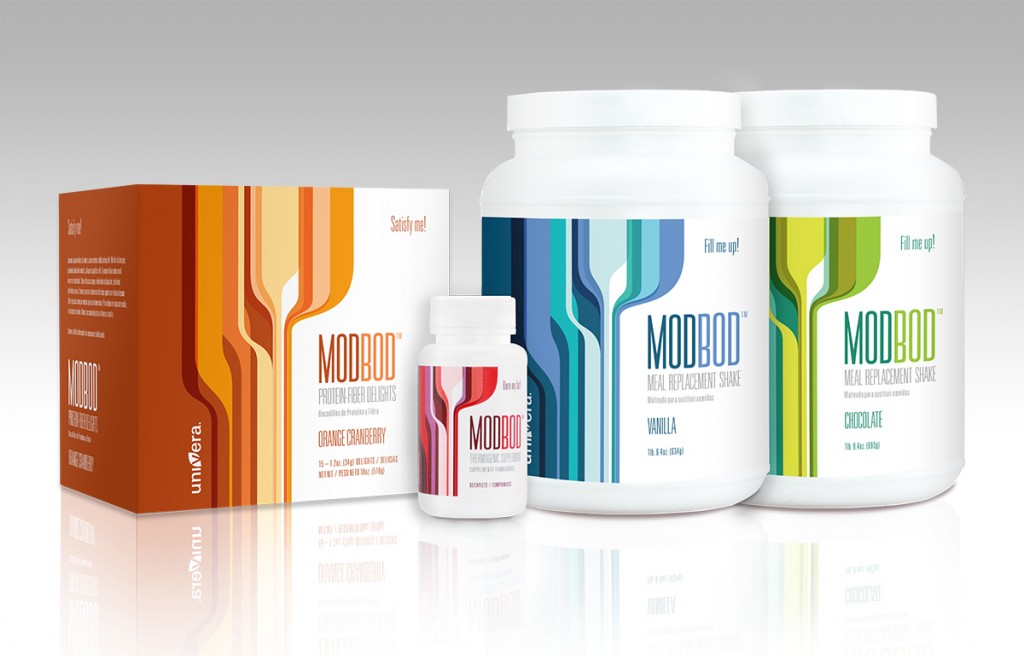
TITLE: ModBod: Our client’s new weight management system, ModBod, was unlike any product line they’d launched before and really needed to make a splash in the crowded marketplace of nutritional supplements and diet aids. The product positioning encourages customers to regain that youthful figure they once had by engaging in whole new approach to weight loss and healthy living. Reflecting the positioning, the visuals have a bold, modern look but with a nod to the past—the place where that “youthful you” lived. Bright color and dynamic shapes infuse the designs with energy and draw in customers through a friendly and optimistic palette.
CLIENT: Univera
CREDITS: CD Jim Craig; Strategy Melinda Torres; Designers Susan Phillips, Lesley Feldman; AE Kiki Temkin
______________________________________
Photo/Illustration
Big M Winner: TEAM Guilliatt
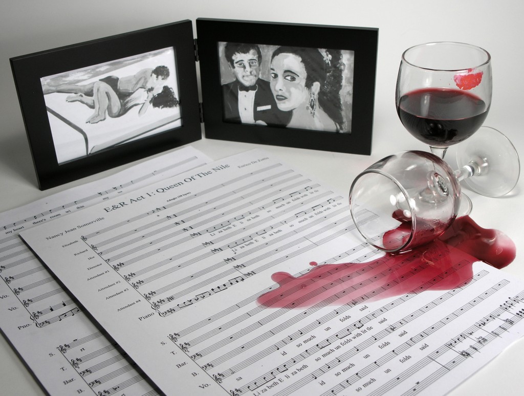
TITLE: E&R Cover Photo: Composite photo depicting the romance, glamour, scandal, tragedy, allure and wonder of the relationship between Richard Burton and Elizabeth Taylor
CLIENT: Nancy Jean Somerville (Libretto) Enrico de Zottis (Composer)
CREDITS: Photography Larry Guilliatt
_______________________________________
Silver M Winner: Monlux Illustration
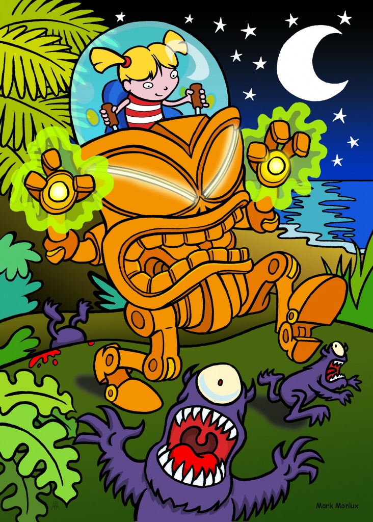
TITLE: Robo-Tiki Terror #1: Self-promotion illustration submitted to the Annual “Monsters and Dames” book produced for charity by Emerald City Comicon.
CLIENT: Mark Monlux
CREDITS: Monlux Illustration
_______________________________________
Bronze M Winner: Hansen Design Company
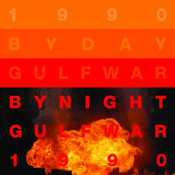
TITLE: AIGA Centennial Celebration Art – 1990: The American Institute of Graphic Arts invited 100 designers to each create a piece of art that commemorated a year they were given to make a political or cultural statement about. I was given 1990, the Gulf War year—the first war we watched on TV 24-7.
CLIENT: AIGA
CREDITS: Designer Pat Hansen
______________________________________
Publications
Big M Winner: Jones Advertising
TITLE: Ben Bridge 2013 Bridal Catalog: The 2013 Bridal Catalog for Ben Bridge Jeweler. Click on the cover above to view the entire publication.
CLIENT: Ben Bridge
CREDITS: Mark Jones, David Edgerton, Stephen Gose
_______________________________________
Silver M Winner: Tiger Oak Publications
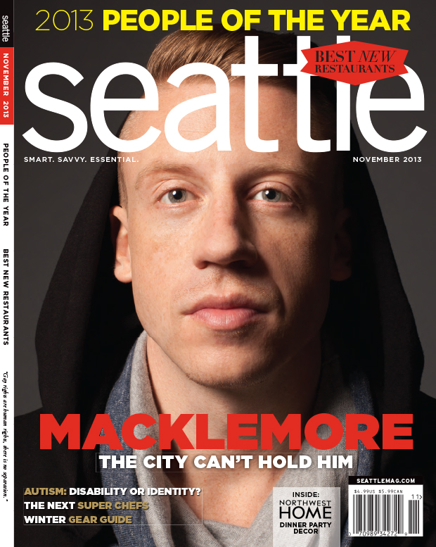
TITLE: Seattle magazine – November 2013: The Macklemore issue was capturing one of our city’s–and now world’s–biggest new music personalities a moment in time for our “Most Influential People of the Year issue.” Click on the cover above to view the entire publication.
CREDITS: AD Stephanie Mennella; Cover Photo Hayley Young; Styling Hilary Folks; Tiger Oak Publications Staff
_______________________________________
Bronze M Winner: Jones Advertising
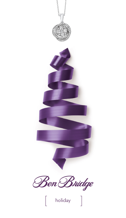
TITLE: Ben Bridge 2013 Holiday Catalog: The 2013 Holiday catalog for Ben Bridge Jeweler. Click on the cover above to view the entire publication.
CLIENT: Ben Bridge
CREDITS: Mark Jones, David Edgerton, Stephen Gose

