Corporate Logo
Due to the large number of entries in this Category, three Big M, Merit Award and Merit Mention winners were selected. The winners are listed in alphabetical order below.
Winner: Craters of the Moon
Veterans Promise Coffee: Corporate ID for VPC. Veterans Promise Coffee is a not-for-profit company this is securing futures for our returning veterans and their families. Offering entrepreneurial opportinities for our vetrerans that have done so much for us.
_____________
Winner: Sibyl Design
Hi-Fi Brewing Logo: Hi-Fi Brewing wanted a logo that recalls the flavor of 60’s and 70’s recorded music—retro without being cliché. This logo employs period typography and ties the beer to the music in a fresh, fun way.
_____________
Merit Award: Eben Design
Seattle Repertory Theatre: The Seattle Repertory Theatre is one of the northwest’s premier performing arts institutions. To celebrate their 50th anniversary, we created a modern and clean logo to appeal to their established patrons and younger theatre goers. The lowercase srt in the icon depicts the new tagline we created “Life onstage.”
_____________
Merit Award: GreenRubino
Obliteride Logo: To gain broad support, build community and raise funds for cancer research within the Pacific Northwest, Fred Hutch launched a fundraising bike ride. Our agency developed the name, logo, tagline and visual identity that stood out on its own, unique from the Fred Hutch brand.
_____________
Merit Mention: BAJI Group
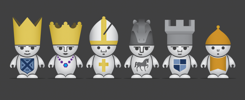
First Move: First Move is a chess curriculum for 2nd and 3rd graders. We worked with First Move to refresh their brand and build a new website, including designing fun chess characters for their promotions and curriculum videos.
_____________
Merit Mention: Marketing Puget Sound
Experience Tacoma Rebrand: Formerly known as the Cross District Association, Experience Tacoma received a complete re-branding, inviting the public into Tacoma with a strong call to action. Marketing Puget Sound helped Experience Tacoma to set the example so other major cities can encourage districts to work together to create a community driven platform.
______________________________________________________
Brand Logo
Due to the large number of entries in this Category, three Big M, Merit Award and Merit Mention winners were selected. The winners are listed in alphabetical order below.
Winner: CKA Creative
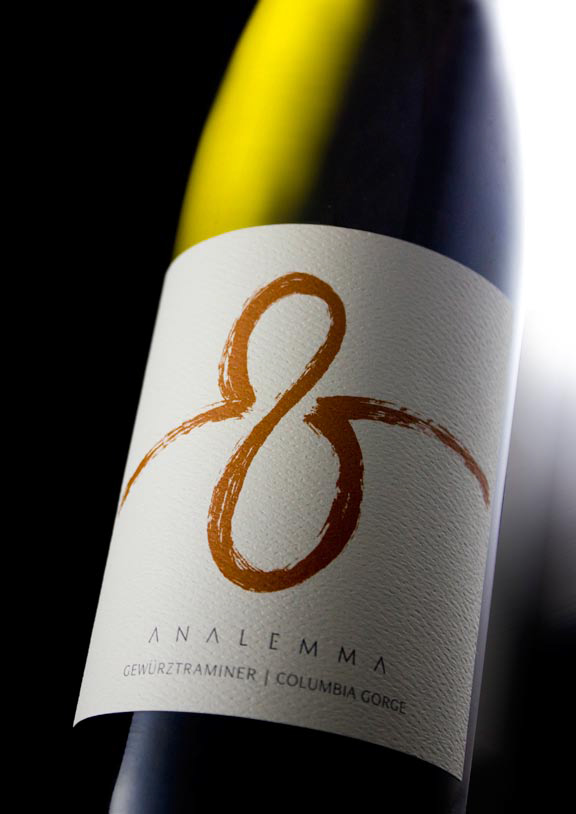 ANALEMMA: How do you translate a celestial occurrence into a viticultural experience? In an earthy, painterly flourish that stands out as a freestyle expression of what awaits inside.
_____________
Winner: Hornall Anderson
Quaker Brand Makeover: With a 135-year-old heritage of conveying trust and tradition, Quaker faced global fragmentation and waning sales. Research indicated that the “Quaker man” is considered a positive symbol of the brand worldwide. But consumers were hungry for an optimistic and modern expression that better reflected the way oatmeal made them feel.
To contemporize his look, we made him appear more energetic, younger and several pounds lighter. Through subtle retouching to his face and neck and shortening his wig, he essentially went on a diet. The refreshed identity now represents the healthy lifestyle the Quaker brand embodies worldwide.
_____________
Merit Award: Craters of the Moon
Ninthward Skis: Ninthward Skis. Corporate re branding and defining the Nineward as an insane asylum for freestyle skiers. They are crazy brilliant skis!!
_____________
Merit Award: Walsh Design
Sustainable Logo for Cascadia Packaging Group: Cascadia Packaging Group offers innovative, sustainable packaging solutions for customers throughout the Pacific Northwest. The design is self sustaining – with no beginning and no end.
_____________
Merit Mention: CKA Creative
J. GoodSpace Homes: This custom-home architect launched a new venture to provide pre-planned home designs but with the option to be customized to order. Each floor plan concept mixes traditional with contemporary, so the mark needed to represent a sense of precision and balance.
_____________
Merit Mention: Creative Office Guru
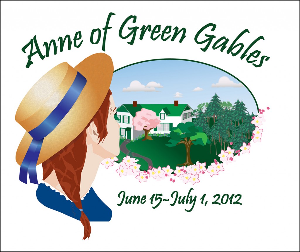
PGT-Anne of Green Gables: Logo designed for use in marketing materials for a theatrical production of “Anne of Green Gables.”
Label
Winner: CKA Creative
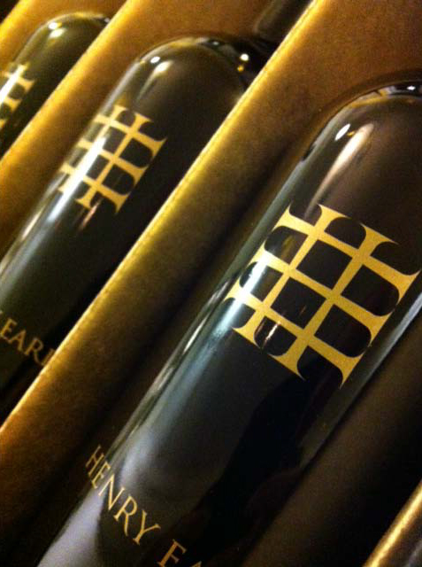
Henry Earl: A budding mover-and-shaker in the Washington wine world, Henry Earl Estates wanted a bold, masculine mark to stand out — both on shelves and in the minds of consumers. The ultimate solution needed to echo ‘refined elegance’ in order to fetch a higher bottle price. Carefully aligning the ‘H’ and ‘E’ yielded a strong lattice-work effect. Gilding all of the brand elements in gold gives this new player a head start to a polished and memorable brand.
_____________
Merit Award: Bullseye Creative
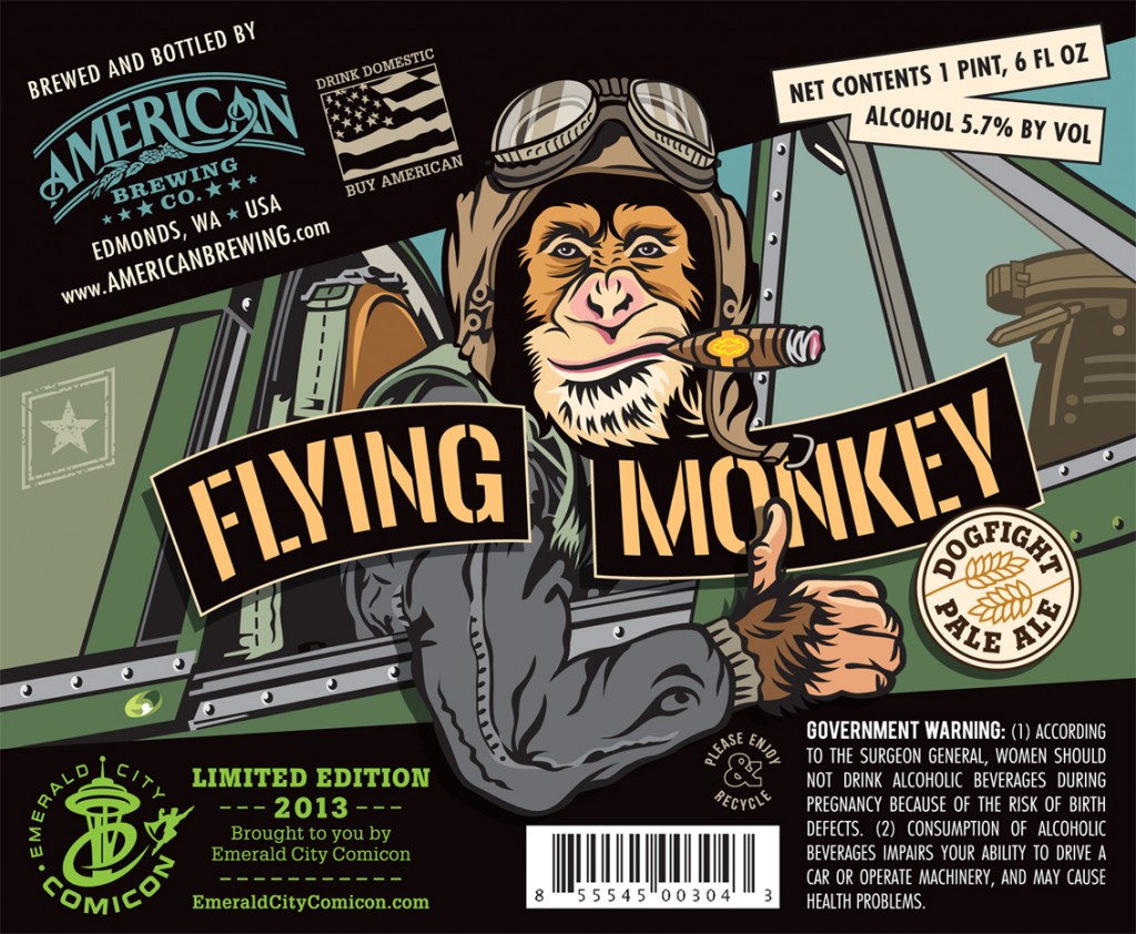
Flying Monkey Beer Label: The Flying Monkey Dogfight Pale Ale, a custom concoction created to commemorate the Emerald City Comicon. The American Brewing Co. beer needed a name and a label and so, in tribute to The Emerald City of Oz, The Flying Monkey was born. We ditched the traditional bellhop outfit and freaky wings, and instead illustrated our attitude-driven Fighting Ape … er, ACE … as a World War II bomber pilot. The popular label design drove sales, and the brew “Flew” off the shelves, selling out everywhere. We also designed a variant label (a common practice in the comic book world), and the brewery threw one of these alternate bottles into random cases. It’s like discovering the Golden Ticket (oops … wrong movie). That’s one sexy beer!! (Note to self: Know when to stop sampling the product when writing descriptive copy.)
_____________
Merit Mention: Hornall Anderson
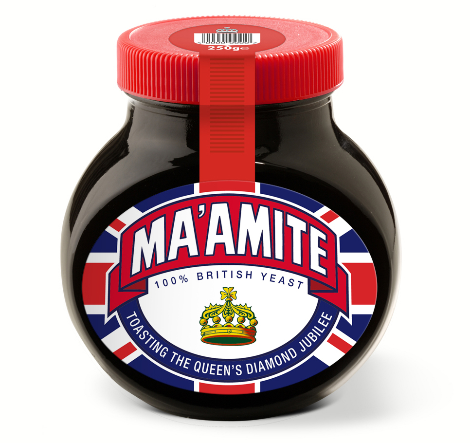
Marmite “Ma’amite” Diamond Jubilee Limited Edition Packaging Label: Marking its 110th anniversary this year, Marmite knows a little something about celebrating longevity and reverence. So in honor of the Queen’s Diamond Jubilee, Marmite partnered with a brand design firm to create the special limited-edition Ma’amite in observation of the royal occasion and as a hat tip to a rousing 60 years of Britishness. Featuring the Union flag anchored by Marmite’s familiar brand equities, the commemorative Ma’amite launched exclusively in Sainsbury’s before making a broader splash in stores across the country.
Poster
Winner: Blankslate Creative
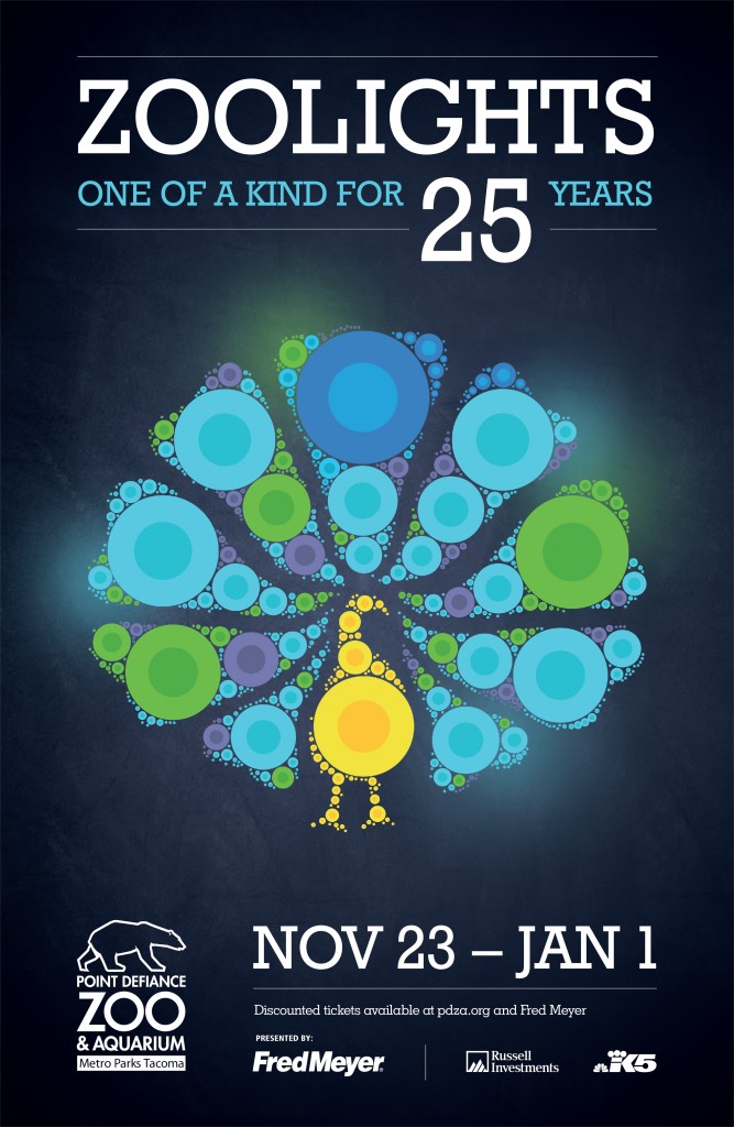
Zoolights 2012: You might be able to see an octopus or peacock at other aquariums and zoos, but an octopus aglow with hundreds of holiday lights on a winter evening with your family? Only at PDZA. In this illustrative direction, the lit animals of Zoolights celebrate 25 years by taking on an identity of their own. this is one in a series of three posters.
_____________
Merit Award: CKA Creative
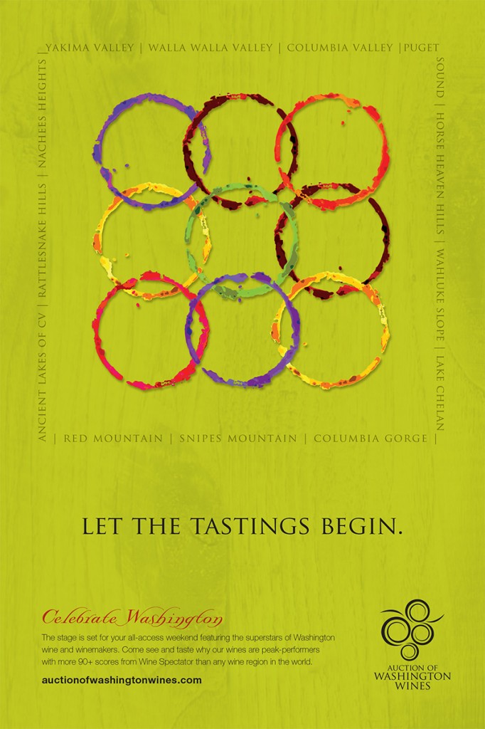
Let the tastings begin!: The stage is set for a wine world extravaganza. Festivities highlight Washington wines as peak performers and superstars of the wine world. The poster’s iconic and colorful rings announced the event in thematic style.
_____________
Merit Mention: The Museum of Flight
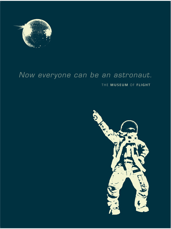
Now everyone can be an astronaut.: The Museum of Flight’s “Now everyone can be an astronaut” dancing astronaut posters surrounded the Nov. 10, 2012, grand opening of the Space Shuttle Trainer. This is one in a series of four posters.
______________________________________________________
Print Piece
Winner: CKA Creative
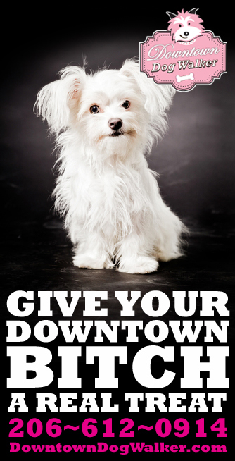
Downtown Dog Walker: To get the word out on the streets of Seattle, we thought: “Let the bitch be the hero.” And the rest speaks for itself.
_____________
Merit Award: Ken Shafer Design
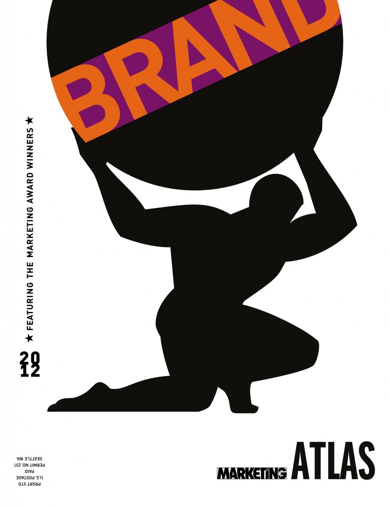
Atlas Cover 2012: Cover art for Marketing Atlas 2012.
_____________
Merit Mention: Hornall Anderson
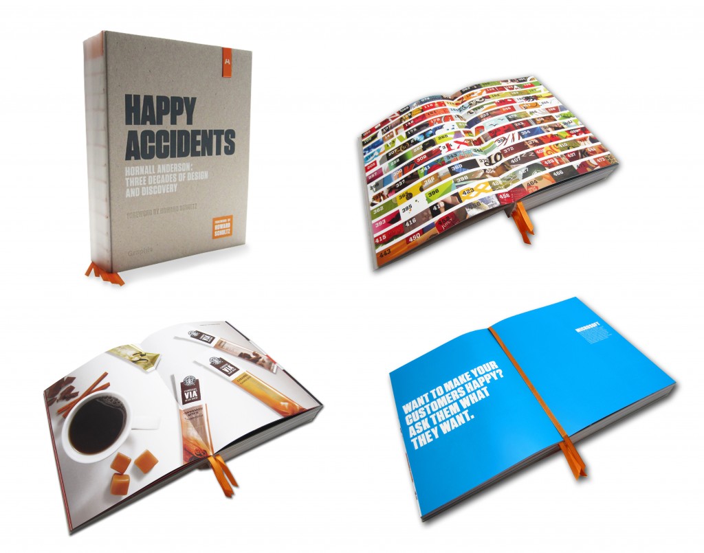
“Happy Accidents” Book: The agency’s newly published book “Happy Accidents” celebrates three decades of design and discovery, and creative collaboration. It’s the result of years spent embracing tensions—big and small, work and play, and the juxtaposition of handcrafted and digital. It’s a look at what they’ve done, who they’ve done it with, and the beliefs they’ve held to along the way.
This six lb., 482-page tome is constructed of four different paper types—gray end-papers are equal to 80# cover, front uncoated gray paper is 157gsm, middle white dull coated is equal to 100# text, back cream paper is also 157gsm—plus a chipboard and PVC cover. Within the book there are many discovered elements, including a branded USB drive integrated into the cover that offers a peek behind the curtain of our agency’s Experience (HAX) Lab, ribbon bookmarks, and exposed binding. And throughout the pages, homage is paid to the 660+ clients and countless projects that have played a vital role in helping them to become who they are today.
Packaging
Winner: Hornall Anderson
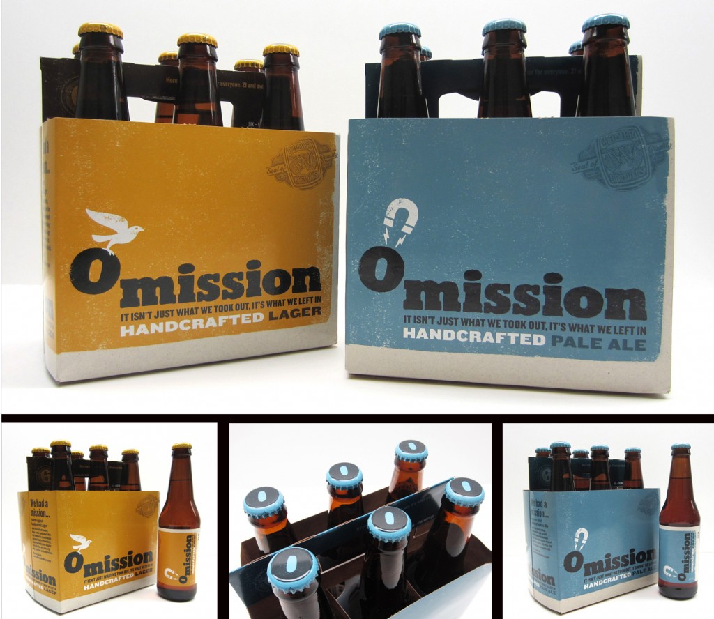
Omission Packaging: With Celiac disease affecting at least 1 in 100 Americans, many beer drinkers are forced to pass up their favorite beverage due to dietary restrictions. To address this problem, Craft Brew Alliance approached a brand design firm to help them launch Omission—the first craft beer brand in the U.S. focused exclusively on brewing great tasting beer with traditional beer ingredients—including malted barley—specially crafted to remove gluten.
Playing off of Omission’s messaging, the agency creative team developed the tagline, “it isn’t just what we took out; it’s what we left in.” They then designed tongue-in-cheek illustrations that reflect the “removal of gluten” without omitting great taste. This is whimsically demonstrated by enlisting a variety of vehicles such as a UFO, bird, helicopter, hot air balloon, magnet, and magic wand.
_____________
Merit Mention: Hornall Anderson
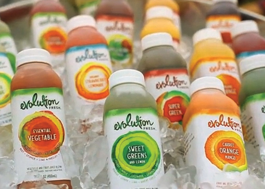
Evolution Fresh Packaging: In this fast-paced, processed-food world, we’ve forgotten the joy of fresh, nutritious food that tastes like what it is. Starbucks had a vision of bringing delicious and nourishing juices to everyone. Our agency made the brand come alive in a vibrant, expressive way through more than 200 elements and a captivating retail experience.
_____________
Merit Mention: Bullseye Creative
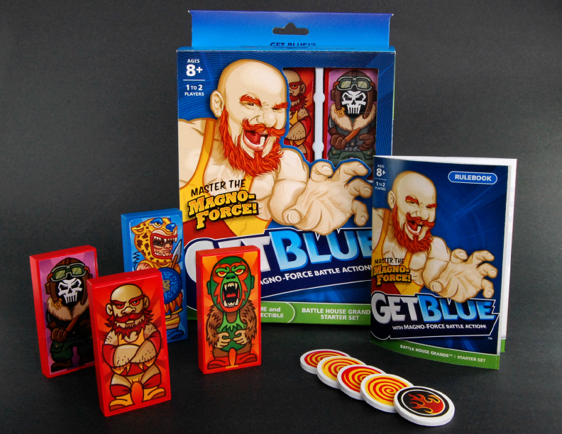
Get Blue Game Packaging: Get Blue is a collectible, table-top game featuring spinning discs, big-time collisions and Magno-Force Battle Action!™ (insert Tim-The-Toolman-grunt here!). Get Blue is a game of skill, finesse and kinetic fun situated in a world of mythic characters and awesome adventures. We designed every aspect of the game and packaging – from character tile illustrations and spinning disc art to rulebooks and box graphics. You may ask, did we ever “Get Blue”? We did, indeed. Not to brag, but it was a pretty big deal.
Photography
Winner: Parks Creative Photography

Moonlit Yarrow Bay Home Photograph: Hero image for combined campaign of realtor and homeowner. One of twenty-two interior, exterior, and view images created for client.
_____________
Merit Award: TEAM Guilliatt
Man next to Pipe Piling: Man standing next to Pipe Piling Pier 56.
_____________
Merit Mention: Everett Source
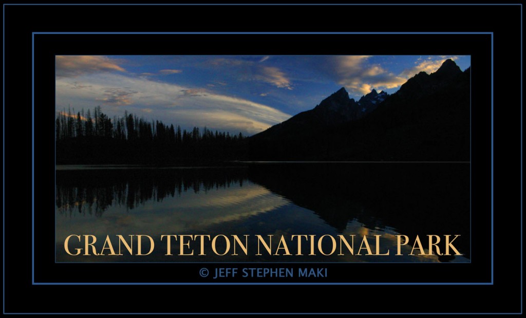
Teton Park: Dusk Image of String Lake at Grand Teton National Park — used in article about youth who wrote about experiences while visiting the area..

