Print Ad
Big M Winner: Hodgson/Meyers
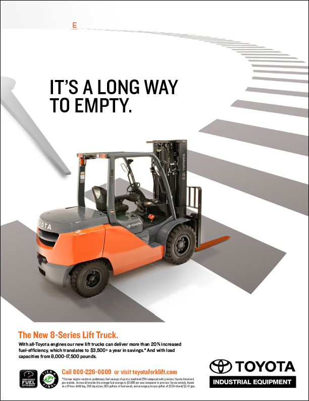
TITLE: “E”: This trade magazine print ad was directed at companies that use heavy-duty forklifts. Communication objective was to show the fuel-efficiency of Toyota’s new 8-Series Forklift.
CLIENT: Toyota Materials and Handling
CREDITS: Acct. Dir. Mary Kate Baker; CD Gary Meyers; Writer Gary Graf; AD Charlie Worcester
_______________________________________
Silver M Winner: BrandQuery
TITLE: Erase Breast Cancer Campaign: October is Breast Cancer Awareness Month and our client was looking to us to address it in a unique way. The campaign included newspaper, direct mail and online. In discussions with the client regarding other cancer campaign work, they liked language that included Beat Cancer. After several concepts, our lead designer came upon a discovery: by removing the r and the s, breast now spelled “beat.” Born was the campaign “Erase Breast Cancer.” All print components illustrated a simple type and graphic treatment; online advertising played an animated erasing of the r and s.
CLIENT: Skagit Regional Health
CREDITS: BrandQuery including Jacque Beamer, Matt Fisher, Amy Ferree
_______________________________________
Bronze M Winner: AAA Washington
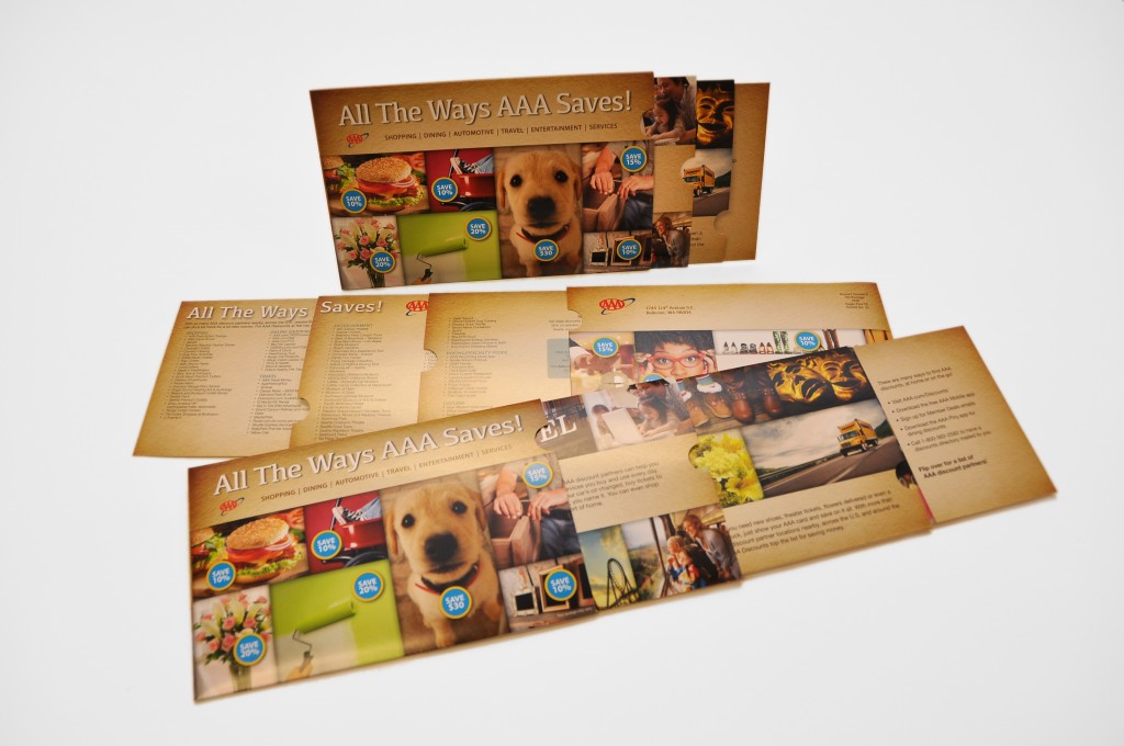
TITLE: AAA Show Your Card & Save Telescoping Direct Mail: We developed an interactive telescoping mailer to increase new member awareness of AAA’s “Show Your Card And Save” Discounts program and its more than 100 local and national discount partners. Approximately 8,000 mailers are sent per month to new members 30 days after joining AAA Washington. Survey results show that discounts are the #2 reason members renew. Feedback has been very positive.
CLIENT: AAA Washington
CREDITS: AD & Sr. Graphic Designer Jessica Amoateng, Writer Brenda Asheim
______________________________________
Consumer Campaign
Big M Winner: AAA Washington
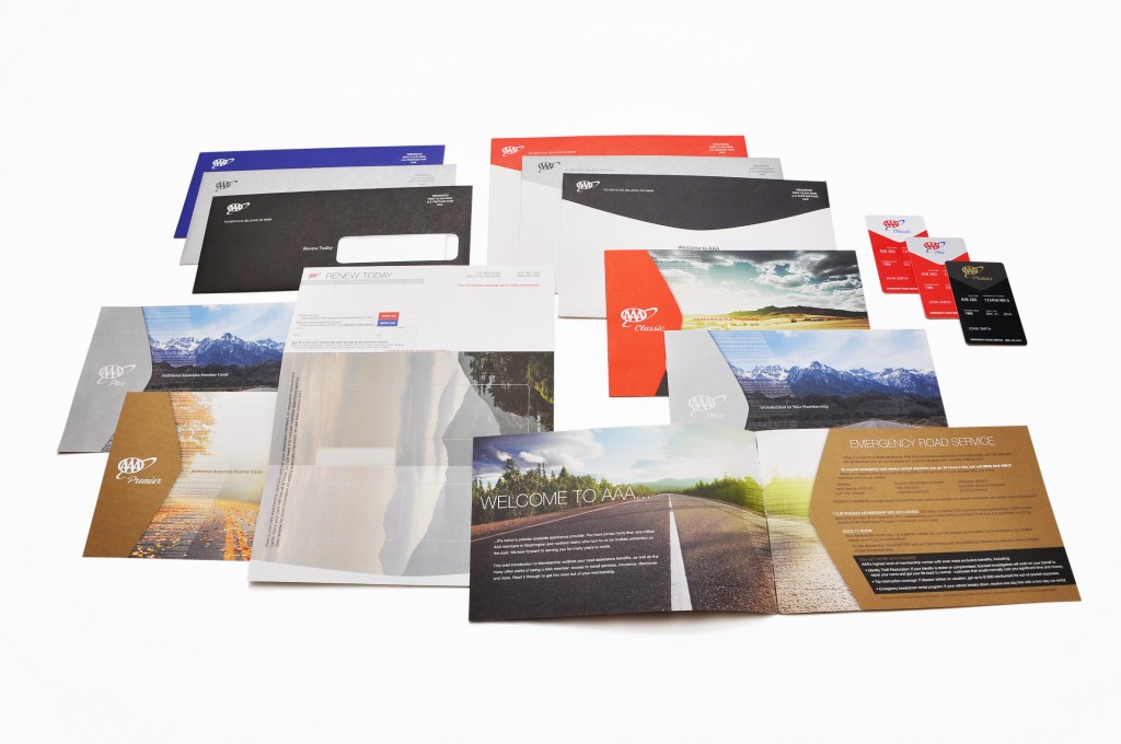
TITLE: AAA Membership Collateral: Every new AAA member is sent this packet of membership collateral, which makes it an important “first-impression” branding piece. Accordingly, we redesigned the entire package to have a more clean, modern look. We also pared down the copy so that the important membership benefits stood out more prominently. The cards were revamped with a vertical orientation and an exclusive matte black color for Premier members. We estimate that more than 65,000 of the new membership packets will be sent out this year.
CLIENT: AAA Washington
CREDITS: AD & Sr. Graphic Designer Jessica Amoateng; Writer Matt Forrest
_______________________________________
Silver M Winner: Pacific Northwest Eye Associates
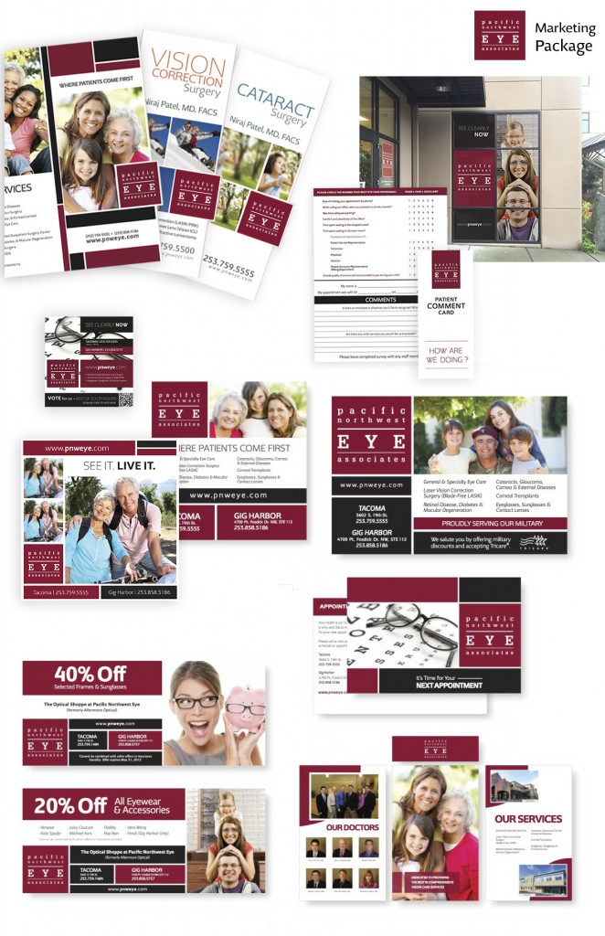
TITLE: Pacific Northwest Eye Associates – Marketing Package: Pacific Northwest Eye Associates needed a marketing plan that matched their excellence in patient satisfaction. Their brand shapes a visual storytelling experience that conveys a mission to provide individual attention to their patients. This campaign showcased a variety of print and ad collateral that communicate their standards for individualized care and motivates patients to share their own stories on review and comment cards.
CLIENT: Pacific Northwest Eye Associates
CREDITS: Bobbie Bailey, Annika Welsh, Ryan Lewis, Vanessa Jose
_______________________________________
Bronze M Winner: Metia
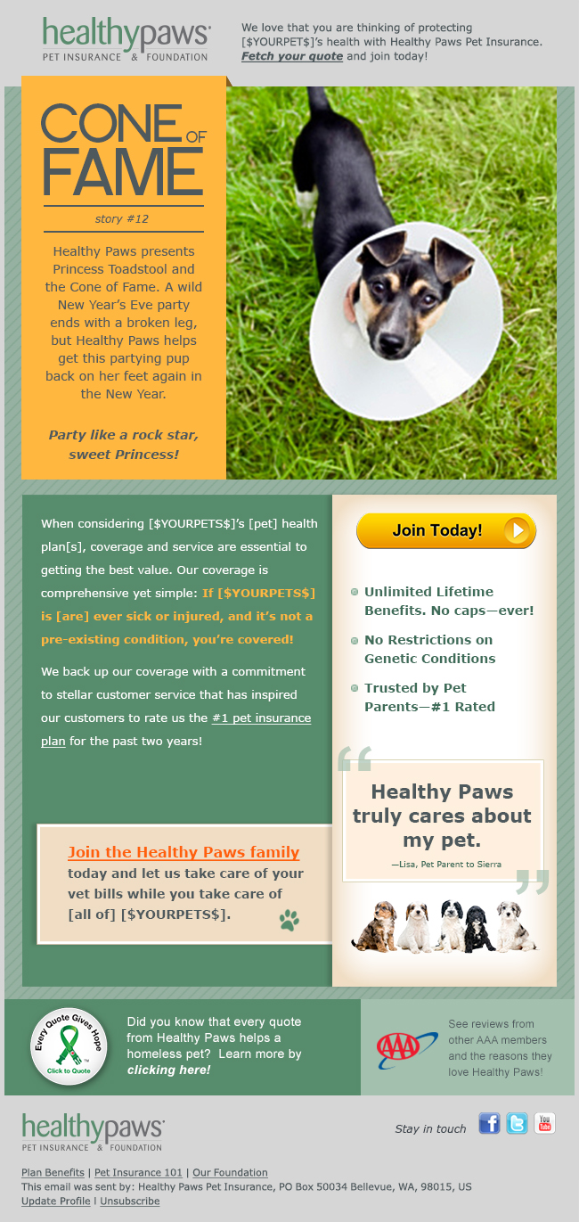
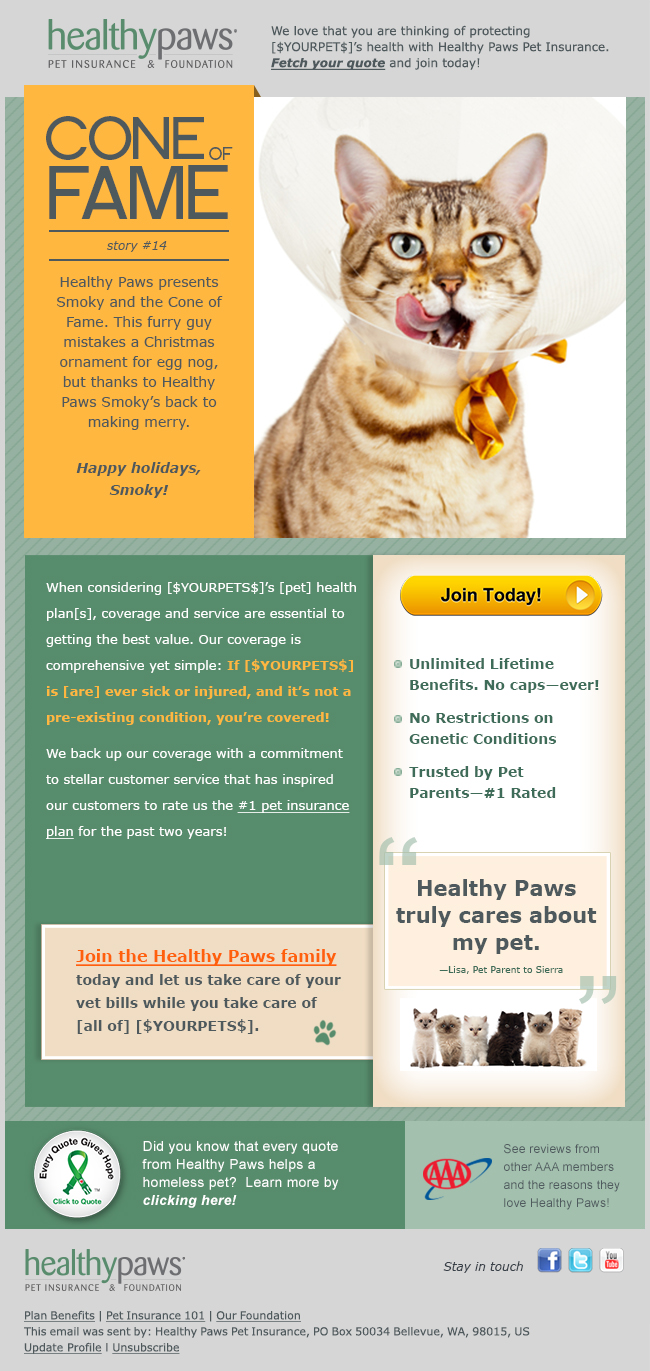
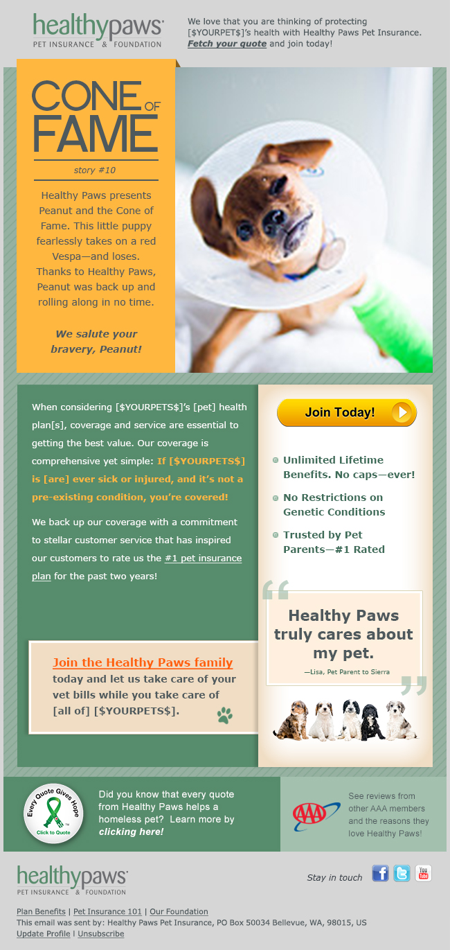
TITLE: Healthy Paws: In order to increase sales and engage customers, the agency developed the “Cone of Fame” triggered email campaign featuring “real-life” pet issues and personalized messaging to showcase Healthy Paws Insurance solutions. We improved email campaign performance across every metric, including sales conversions. The campaigns dramatically differentiated the brand from the competition.
CLIENT: Healthy Paws
CREDITS: Jazzmenn Marini, Samuel Tribble, Alex Hendler, Erik Hollingsworth, Nurit Cusack, Leah Cupps
______________________________________
B2B Campaign
Big M Winner: GreenRubino
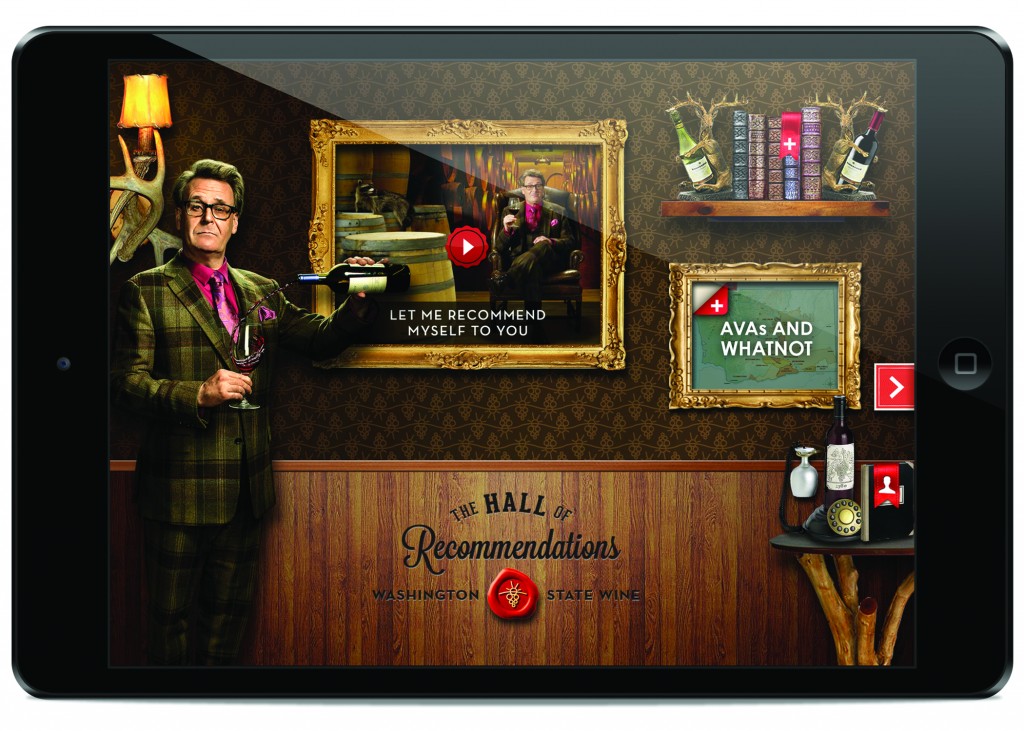
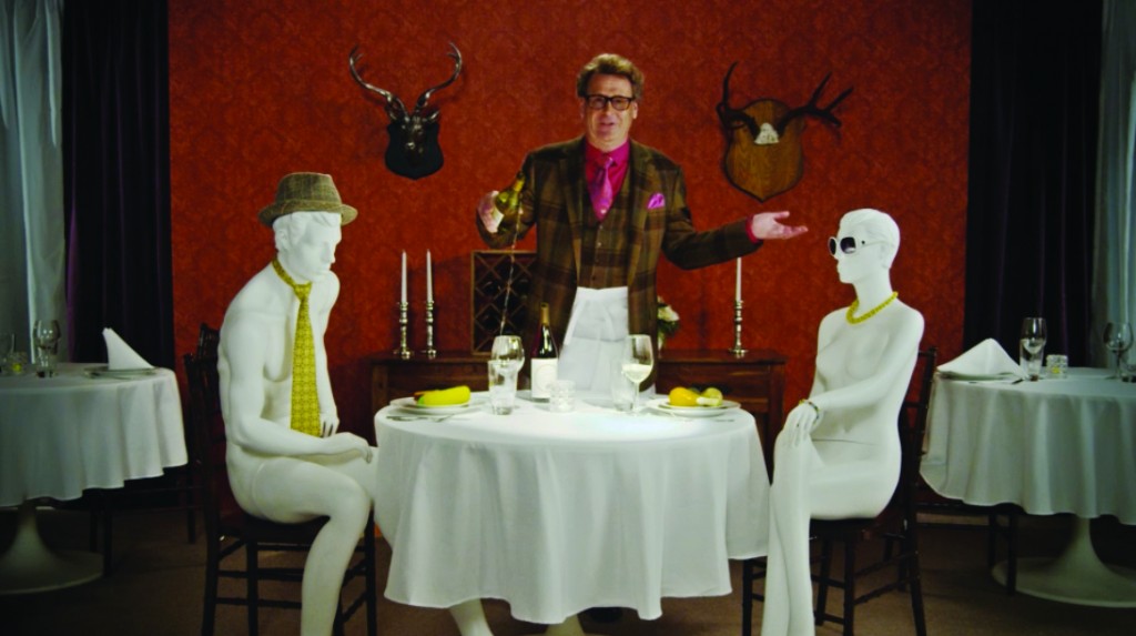
TITLE: The Recommendeuer: When Washington State Wine wanted to bolster top-of-mind awareness with wine trade and media influencers, we created an “outside the wine box” idea—The Recommendeuer, featuring Greg Proops from TV’s Whose Line is it Anyway. The campaign was implemented by shipping/couriering highly designed boxes to 100 individuals. The iPad contained a robust app with videos and content about Washington State wine. The apps were personalized and The Recommendeuer greeted them by name. The concept has been praised by recipients and was featured in stories by ADWEEK, Sunset Magazine, and others. Social Media dialogues continue between The Recommendeuer and the recipients.
CLIENT: Washington State Wine
CREDITS: ECD Cam Green; CD Joe Quatrone; Assoc. CD Dennis Budell; AD Ross Cattelan; Writer Torin Daniels
_______________________________________
Silver M Winner: Hodgson/Meyers
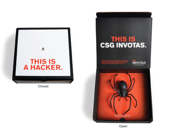
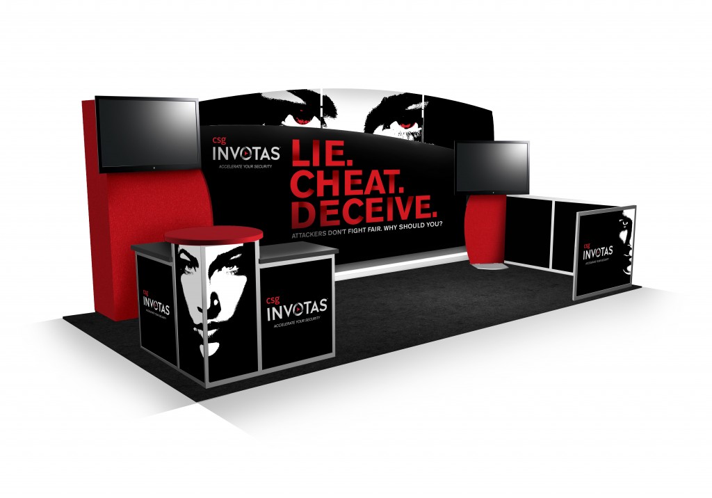
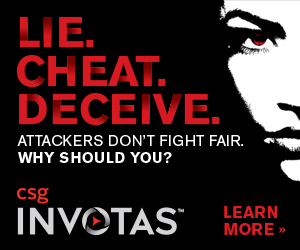
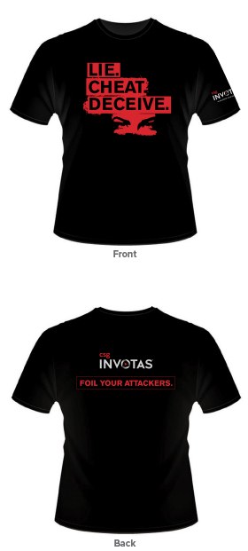
TITLE: “Thou Shalt Lie”: This integrated campaign was directed at government agencies and Fortune 1000 organizations with extremely sensitive data and substantial cyber-security needs who face a continual onslaught of cyber attacks. The campaign was designed to be “uncomfortably disruptive” in an industry where extremely conservative marketing is the norm. These organizations were encouraged to “beat hackers at their own game of cheating, lying and deceiving.”
CLIENT: CSG Invotas
CREDITS: Acct. Supervisor Jason Frummet; AD Mary Kate Baker; AD Charlie Worcester; Writers Gary Meyers/Phil Herold; CD Gary Meyers; Interactive Developer Craig Labenz; Art Production Willem Buys
_______________________________________
Bronze M Winner: C Squared Advertising
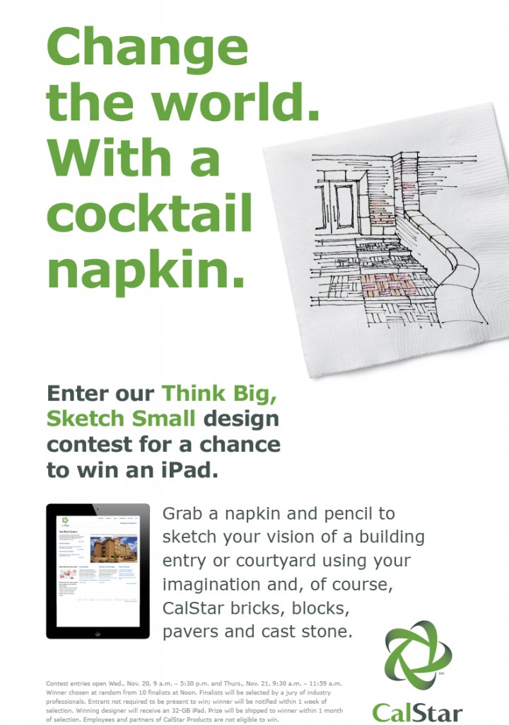
TITLE: Think Big, Sketch Small design contest: A pre- and at- trade show integrated campaign was developed to invite attendees to the manufacturer’s exhibit to sketch a design using bricks or pavers as the main material. The sketch area was a small branded cocktail sized napkin. A winner was picked by trade editors based on original use of the product. The winner received an iPad. Social media, on-site signage, landing page and newsletter ads were implemented to reach attendees.
CLIENT: CalStar Products
CREDITS: ADBrett Davis; Writer Katy Tomasulo; Project Mgr. Brenda Collons

